Jessica Day, Senior Director, Marketing Strategy, Dialpad
Subscription packages are increasingly popular with publishers as they seek to sell access to their content.
By creating a subscription service, publishers are not only being paid for existing content but also for future stories. Often, this monthly or annual payment works out cheaper for customers and gives them access to a broader range of material. A win-win result.
However, as with every product, these subscriptions still need to be marketed to customers and use techniques to convince visitors to become buyers. Along with other marketing campaigns and strategies, a good landing page can increase conversions for your digital subscription program.
It’s important to consider what you include on your landing page and how this impacts your customers.
What Is a Subscription Landing Page?
In some ways, a subscription landing page is like other product pages – it informs the customer about what they’re purchasing, presenting it in the best light.
That being said, as the page focuses on your subscription services, it needs to set out what is and isn’t included along with how the subscription works. Your page should remove misunderstandings while encouraging customers to subscribe.
It’s important to have a specific subscription landing page to help communicate this information clearly, regardless of whether your customers are subscribing to your email newsletter, your entire , or access to your archives.
A landing page also draws additional attention to your subscriptions, helping emphasize their benefits and making them appeal to customers.
What Every Subscription Landing Page Needs
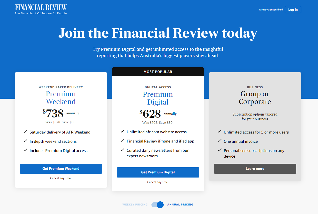
Source: AFR
1. Eye-Catching Headline
As your first impression on potential subscribers, your headline needs to grab their attention. It should be representative of your subscription service, but don’t try to pack everything into it at once.
You can also use sub-headings where necessary to provide some additional information, but generally, your headings should provide an overview within one or two short sentences. If this is all a customer reads, they should still get an accurate idea of your subscription service.
2. Engaging Copy
The following details can go into the specifics of your subscription. It should cover information, such as what it allows customers to access, how often they have to pay and different subscription options.
You can use a commercial template as a guide, adapting it to create a sense of brand voice to engage your customers. Also, using lists and short paragraphs can help readers by breaking up the text.
3. Appealing Images
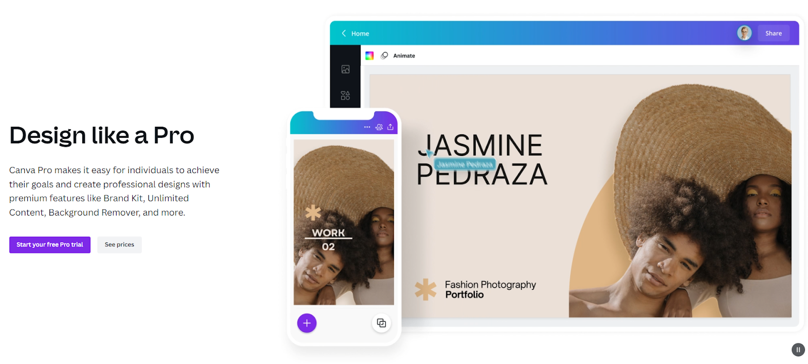
The easiest way to explain what customers receive from their subscriptions is often by showing them. Use high-quality images to show examples of your product in action or the interfaces that subscribers interact with.
Alternatively, using animations and videos can demonstrate how your subscription service is used. Images make your landing page easier for browsers to skim through and remember, making them more likely to return in the future to subscribe.
4. Compelling CTAs
As much as your landing page needs to be informational, it also needs to get customers to subscribe. Using call-to-actions (CTAs) throughout the page can help instruct customers on how to respond.
Through testing, work out which CTA drives the best responses, what your buttons should look like and where on the page to place them. What your customers respond to may change, so your CTAs need to adapt to keep driving conversions.
Source: Canva
5. Convincing Social Proof
Seeing the opinions of someone who’s tried it first can reach your audience in the consideration stage and convince them to subscribe.
This validates that your services and products are as you describe them and are worth investing in. Gather feedback from existing subscribers through forms or review platforms, displaying this clearly on your subscription landing page. Furthermore, use customer satisfaction statistics to provide further social proof.
Build Your Subscription Landing Page
If you’re looking to see more conversions with your subscriptions, it’s worth reviewing your subscription landing page or building a new one if you don’t have one already. It gives customers important information about your subscription services and convinces them to sign up.
Without a landing page, it can be difficult for customers to be sure of how your subscriptions benefit them and the actions they need to take to become a subscriber. What you include on your subscription landing page may vary over time or depending on your target market, displaying different features or highlighting various ways of using the subscription.
As your business targets adapt and change, your subscription service goal examples may also change, requiring updates to your landing page to align with these. However, these five elements should be included, even if you choose to change the style or content they cover.
Disclaimer: The views, opinions and ideas expressed in this post belong to the author/s and do not necessarily reflect those held by State of Digital Publishing.


