The digital revolution has increased pressure on media organizations to scale up their publication frequency, complicating editorial workflows in the process.
Media organizations are expected to produce content on a 24-hour cycle and constantly provide multiple websites with a stream of breaking news. Needless to say, this pressure has created a need for software that streamlines editorial processes.
That is where Superdesk comes in: a platform that markets itself as a digital newsroom.
What Is Superdesk?
Superdesk is an open-source, headless content management system (CMS) designed to replicate all the editorial workflow of a physical newsroom in a browser-based platform. The news management system can be used to organize and monitor incoming content, edit it and then publish it across as many channels as necessary — including websites, social media accounts and Superdesk’s integrated publishing portal called Newshub.
Developed by Europe’s largest developer of open-sourced news media tools, Sourcefabric, Superdesk is designed to automate and streamline the content creation and publishing process. This platform is particularly suited to the challenges of the round-the-clock news cycle.
While the platform is purpose-built for news agencies, a variety of publications would find it useful, including trade and corporate publishers.
Superdesk’s Pricing
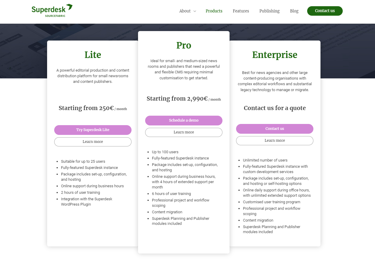
There are three different Superdesk pricing options for publishers:
- Lite: €250 (~$275) per month for up to 25 users
- Pro: €2,990 (~$3,275) per month for up to 100 users, with planning and publishing models and integration with many legacy systems — this is the version we tested.
- Enterprise: An unlimited amount of users and support for a custom price.
While Superdesk may seem on the expensive side of CMS platforms for publishers, it is cheaper than some of its larger competitors. At the same time, Superdesk’s range of pricing options make it a viable solution for both small and large enterprises.
Getting Started With Superdesk’s Dashboard
The first step to getting to grips with the Superdesk platform is to understand how to maneuver through its menus.
Using the drop-down menu at the top of the screen allows editors to sort between different desks — the term Superdesk uses to differentiate different forms of content — such as news, opinion, etc. This organizes content in other windows as well, such as in the Monitoring view, helping users to quickly sift through large volumes of content that different desks and writers are working on.
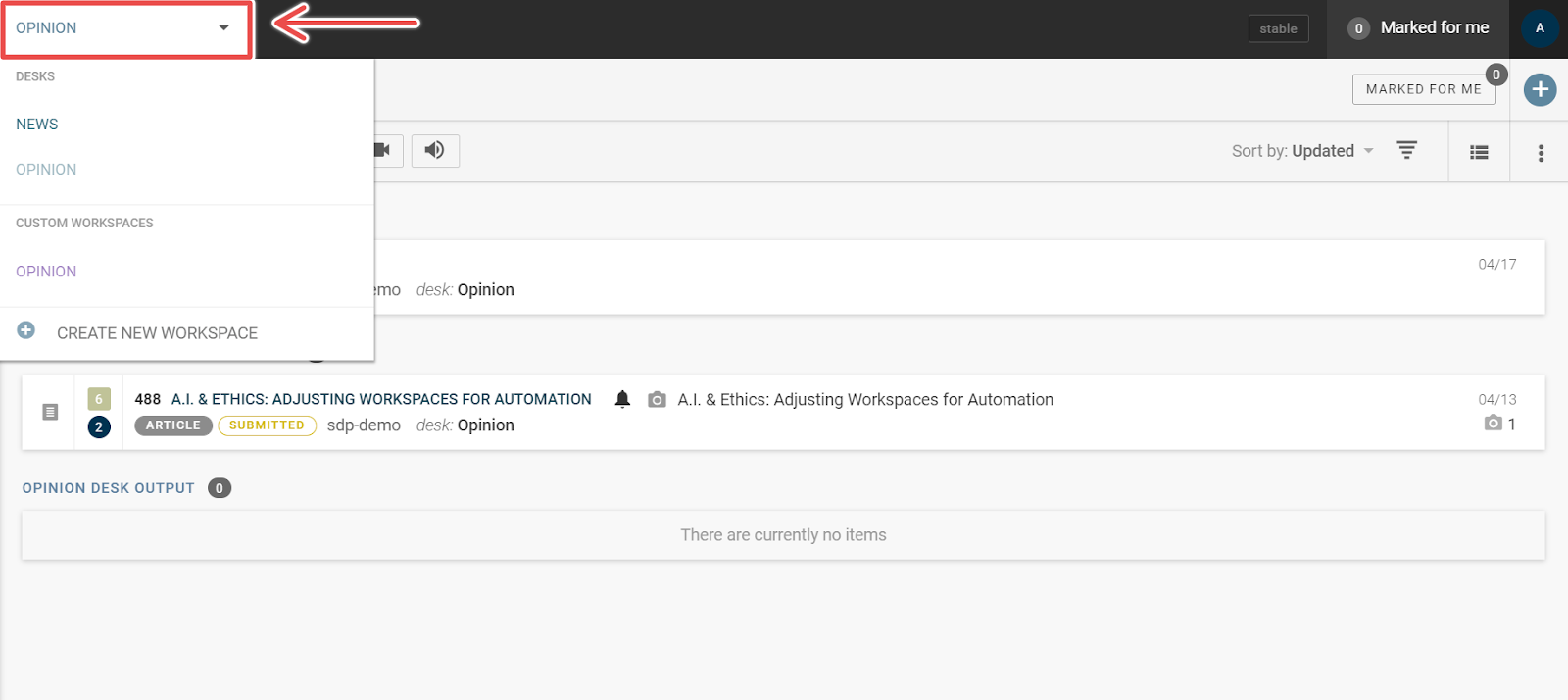
The “hamburger” window found to the left of the drop-down menu can be used to open the Main Menu, where users can find the platform’s settings as well as access the publishing queue and user management tools.
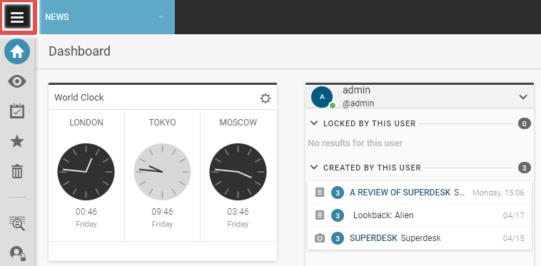
Opening the Main Menu provides access to a range of options such as User Management — where additional users can be added — and Settings — where new desks and user roles can be created and assigned.
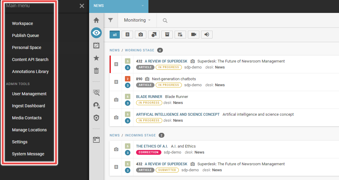
Finally, there is the Workspace Sidebar that allows users to navigate through the various content pipeline windows.
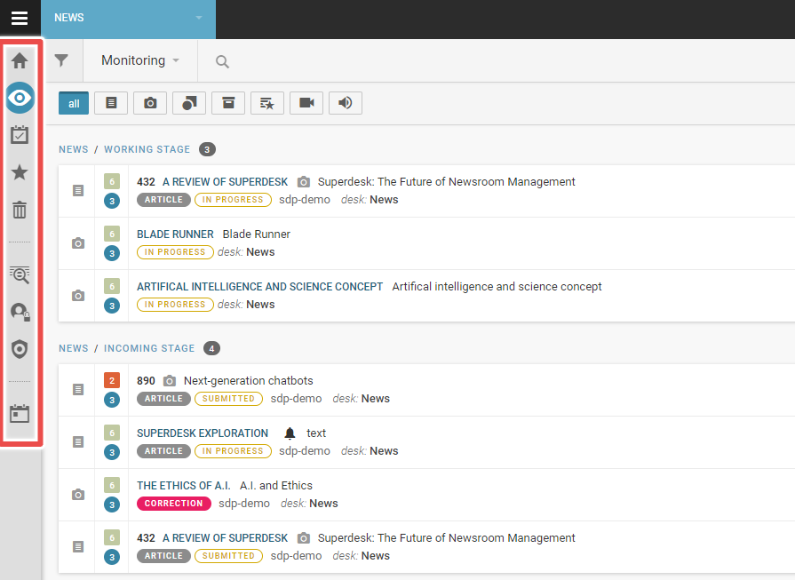
Here users can find the Monitoring window, their Dashboard and some other windows such as Highlights and Assignments.
Dashboard
The first place an editor starts with the platform is the overview dashboard, pictured below.
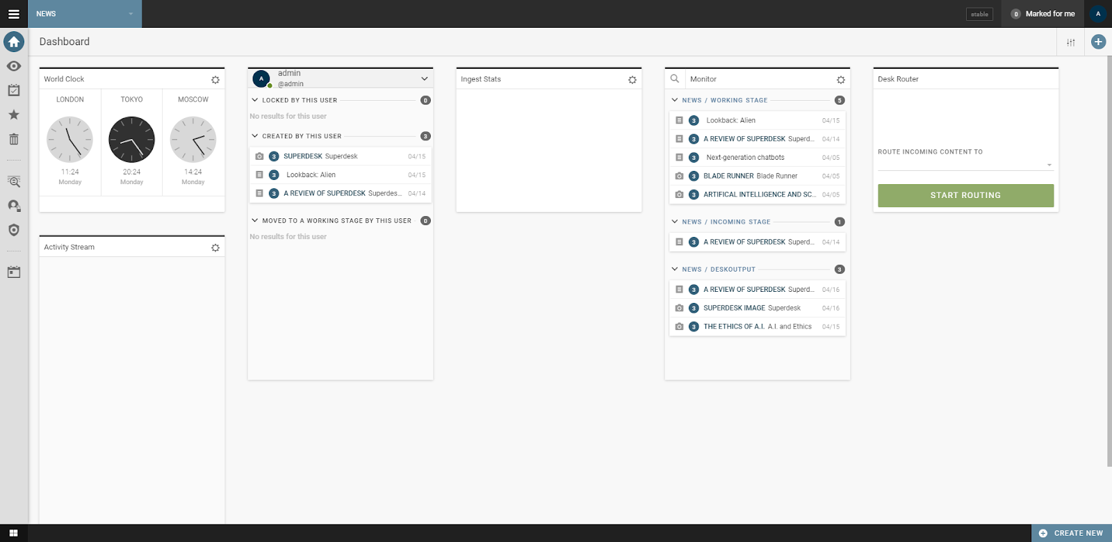
This dashboard is entirely customizable, allowing users to tailor their workflow to suit their needs. Customizing the dashboard requires adding widgets, which can be found by clicking the plus sign at the right-hand corner.
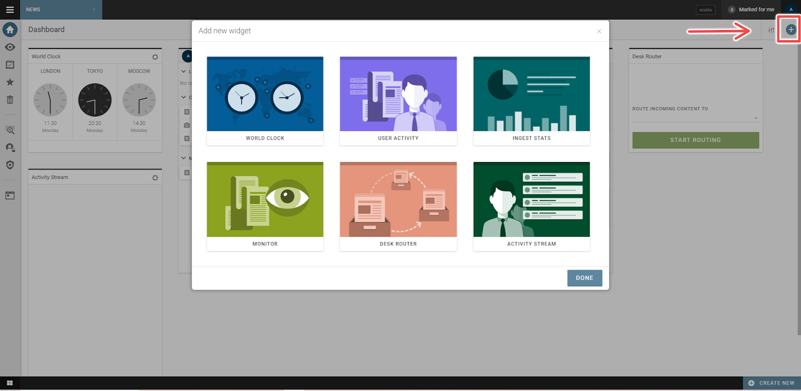
This workspace can be used in a variety of ways, including as a document manager for various pieces of media — such as articles or images, or as a quick way to gauge different time zones for global publications. The time zone feature is useful for international publications to either publish at a standard time or for communicating with team members across different time zones.
Most importantly, though, the Monitoring widget is a quick way for editors to see which content is in the pipeline, and how individual pieces of content are progressing without switching to the Monitoring tab itself.
The Activity Stream widget presents all activity related to the user, essentially what content has been assigned to them. There are three other widgets. The first provides stats on ingested content, the second is an activity stream and the third routes content to other desks.
Monitoring
Moving away from the Dashboard, users are likely to spend most of their time with the Monitoring tab, which provides an overview of all content that their assigned desk is currently handling.
These projects can be quickly filtered using a series of buttons at the top of the workspace.

The Monitoring section provides editors with a great deal of detail on projects and where they sit within the pipeline — from the working stage through to editing and publishing.
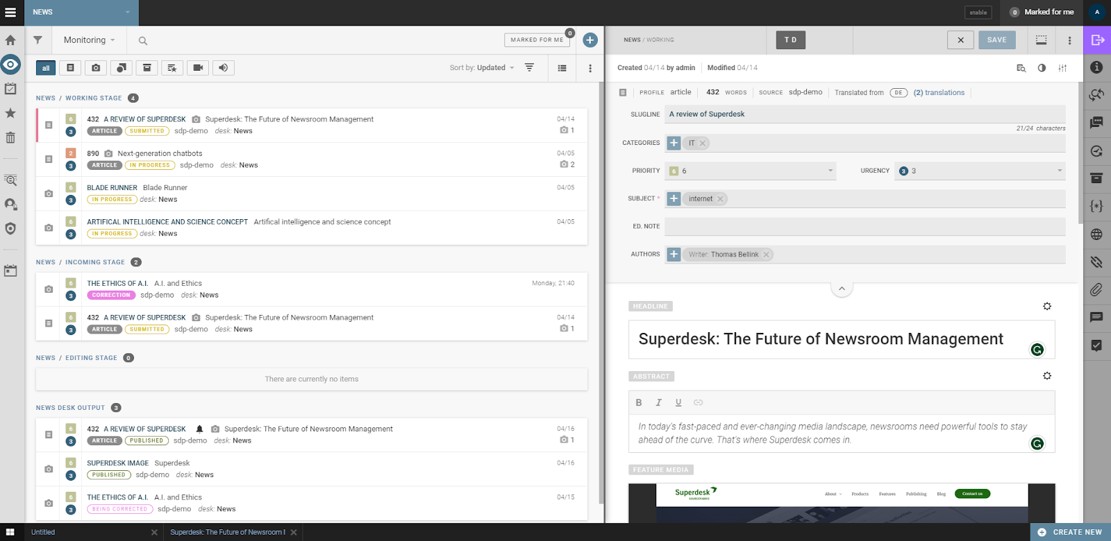
Editors can create new articles using the plus sign in the top right corner of the Monitoring section. To edit existing projects simply click on its three dot menu and select the required function.
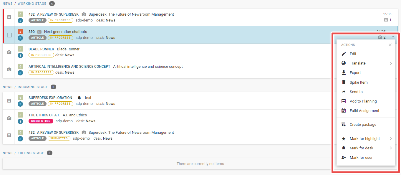
As a quick tip, editors can focus on just the text editor by hitting the Monitoring tab icon on the left-hand menu to collapse the pane. They can also adjust the size of individual windows by dragging the sides.
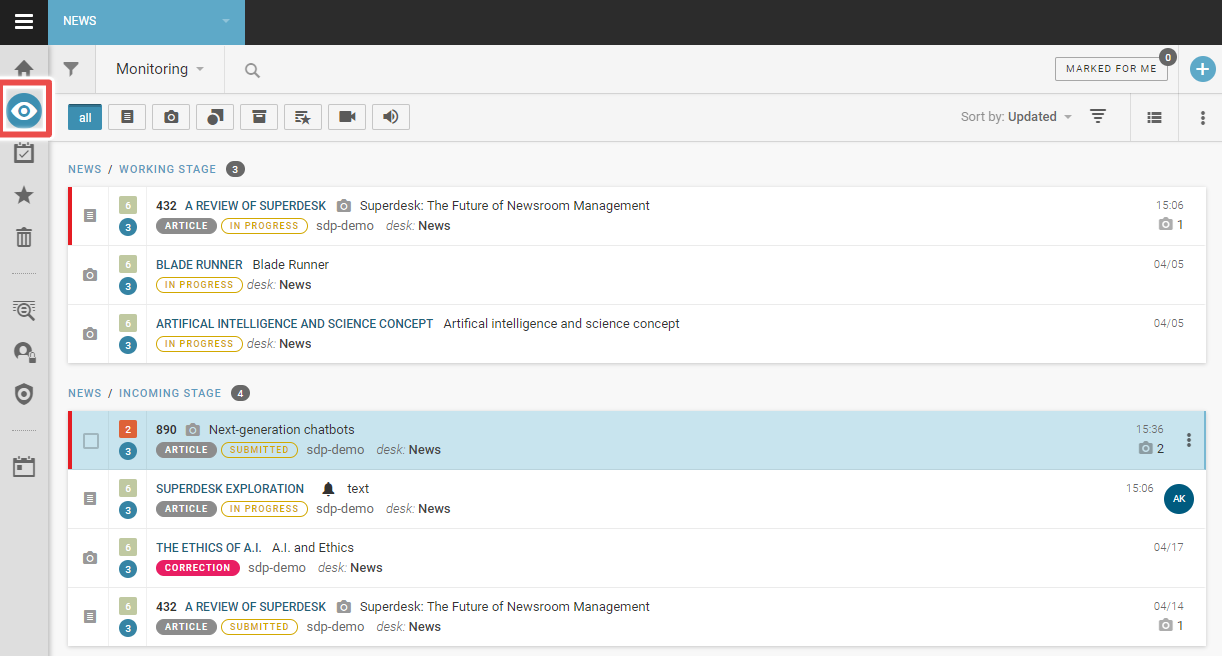
While the option to collapse the window is definitely a useful feature, we found its design to be a little obtuse. Unlike the “close” button on the project window, it’s not immediately clear to the user how they’re supposed to close the Monitoring panel, or even that this is a possibility.
In fact, there are a number of design decisions that don’t particularly serve the user experience; the text editor’s toolbar is one such case. Some of the text editor’s most important and useful tools — including the button to send content to the publishing or working stages — are found in the right-hand sidebar.
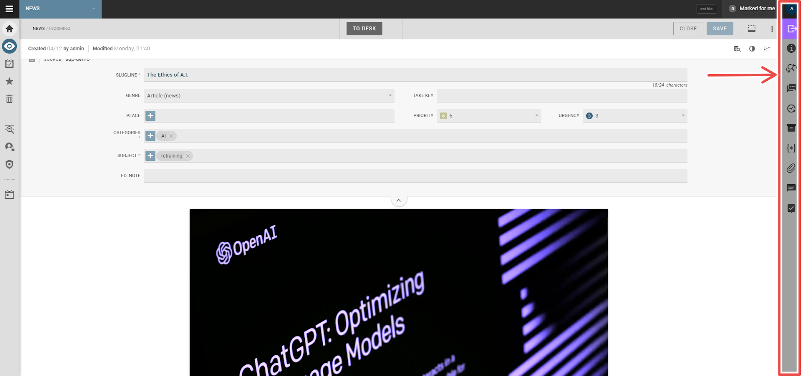
We have a couple of small gripes with this sidebar: its coloring and position.
The sidebar’s darkened gray tone means it blends into the background, and subconsciously suggests that it can’t be interacted with — that it’s “grayed out”. Its parallel positioning to the left sidebar, meanwhile, suggests that both are used for similar purposes, which isn’t the case. There’s a reason the most popular general text editors have their toolbars in an upper ribbon.
In the end, though, we’ll admit these are small gripes when contrasted against the text editor’s impressive range of tools.
These tools include, for example, a basic image editor that is more in-depth and efficient than most other integrated solutions. The image editor can automatically crop to the most important part of the image and has tools to add image metadata in-program.
The text editor can also embed other forms of rich media including video and audio. Moreover, it features inbuilt comment features, with options ranging from in-line commenting to tagging other editors.
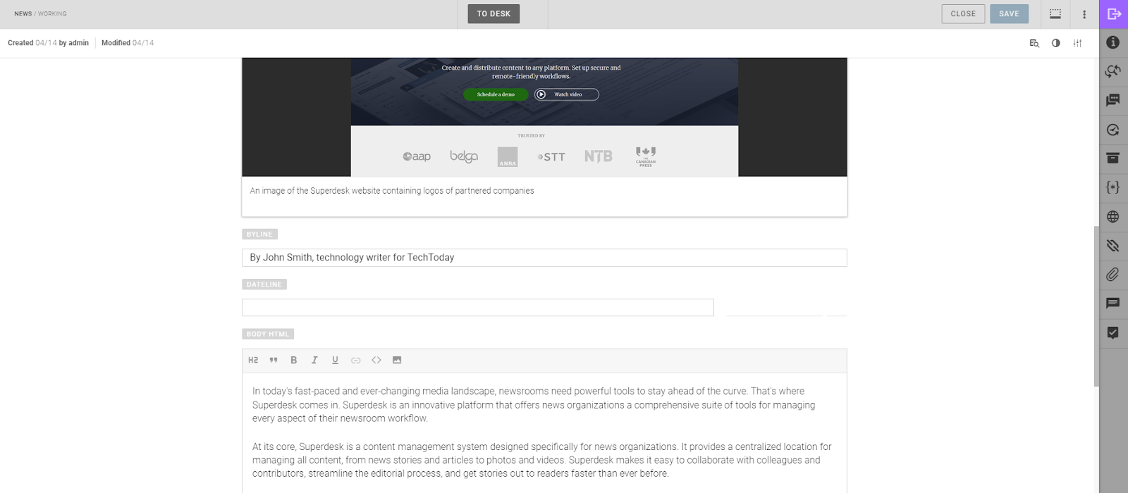
While both the text editor and personal dashboard are well-crafted, in-depth tools with a great deal of capability, when compared to well known dedicated text editors, Superdesk lacks some of their depth.
This is hardly surprising, given that the likes of Microsoft Word or Google Docs are designed purely for text editing rather than Superdesk’s broader approach to news publishing. However, we cannot deny that Superdesk lacks some of the keyboard shortcuts available in Word or Docs, which improves their functionality and efficiency.
As such, we’re not convinced that Superdesk is where the actual writing or initial edits should be conducted.
We’ve written an extensive guide to mouseless editing that leverages many of the available navigation and control shortcuts for Google Docs and, to a lesser extent, Microsoft Word to speed up the content creation and editing process.
One basic navigation convention, using the Ctrl + arrow keys to navigate to the start of hard returns, didn’t translate seamlessly to Superdesk. Using the image below as an example, we wanted to navigate to the start of the paragraph above the text cursor (or caret). We’d expect that Ctrl + up arrow would achieve this, but in Superdesk that command moves the cursor to the start of the line above.

This is admittedly a small issue, but it does speak to the convenience of using a dedicated text editor.
Another issue we ran into was a lack of formatting options, with the H2 being the only Header format available to us during our hands-on with the platform. When asked about this, the Superdesk team explained that the extra formatting options weren’t included in our demo. While we can’t personally speak to options that we didn’t use, have a look at the demo image below for an idea as to the available options.
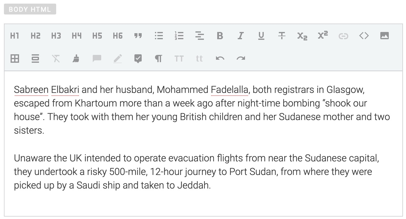
Superdesk seems better suited to the final stages of content editing and publishing. For example, what we appreciated was the feature that allowed editors to preview how content will appear live, and flag anyone in-program if there’s a problem.
So, while we still prefer dedicated text editors for article drafting and initial editing, Superdesk’s text editor feels like the next logical step for late stage editing and then publishing.
Next Steps With the Dashboard
Superdesk has a comprehensive features list and it will take any user some time to get to grips with all of them. The top features to master, however, should be the Ingest Sources system and the already mentioned Monitoring section.
These features handle the overall bird’s-eye view of operations that take place within the Superdesk platform.
Ingest Sources
In the Superdesk platform, ingesting refers to pulling content from multiple internal and external sources, moving it within the platform and readying it for editing. For example, ingesting can take content sent to a dedicated email and adjust it to a template, which can be useful for organizing freelance content.
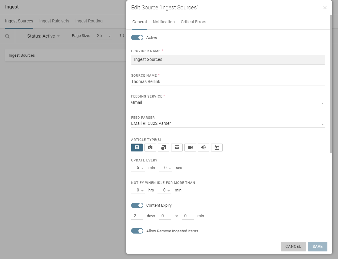
Ingesting can take from multiple types of sources, including:
- Social Media
- RSS feeds
- News wires
However, while we were exploring the platform for the review, we encountered a problem with ingesting content sent to a newly created email. Specifically, the button used to link the email account had a broken Xtml code, preventing us from logging into the Gmail account. Liaising with the Superdesk team revealed that our demo instance had not been configured to work with Gmail, preventing us from exploring this feature.
Monitoring Revisited
As noted above, Monitoring provides an overview of the content production pipeline and can be used for approval process control, such as assigning tasks, using the mark for user feature.
Content can be further organized from desks into different stages of production using the drop-down menu featured below.
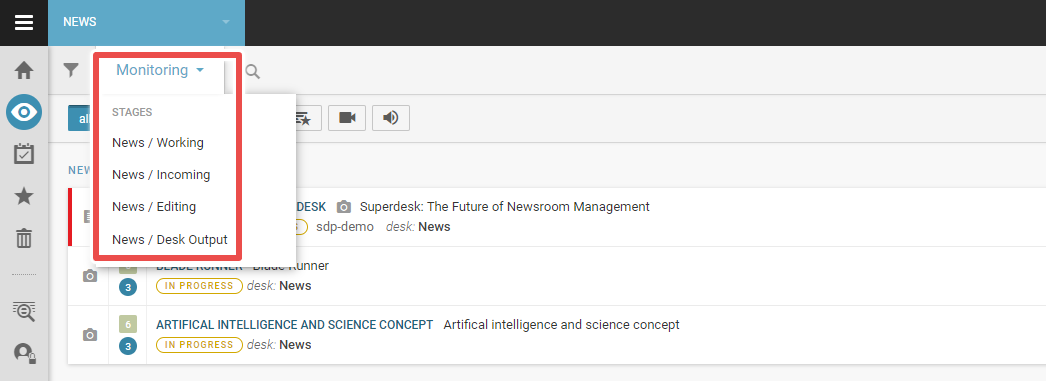
For our demo, four different stages were set up to separate content. The first was the “Working” stage, which starts with article creation and is where the writer can create their first draft. When done, the writer can then submit it to the “Incoming” stage for editing. When editors begin working on a brief, it moves into the “Editing” stage. Finished products are then sent to the “Output” stage where they’re scheduled for publication.
While this was the naming convention and order used for our demo, the workflow is completely customizable for each publisher. It can be called anything, and there can be as many desks as a particular workflow requires. The search bar adjacent to the menu can be used to find items across content type, desk and author.
The perspective here can be as narrow or as wide as it needs to be, affording editors many different viewpoints of their content pipeline so they can more quickly identify potential problems areas and organize a solution. It succeeds as a monitoring and workflow tool without being overly complicated.
Templates
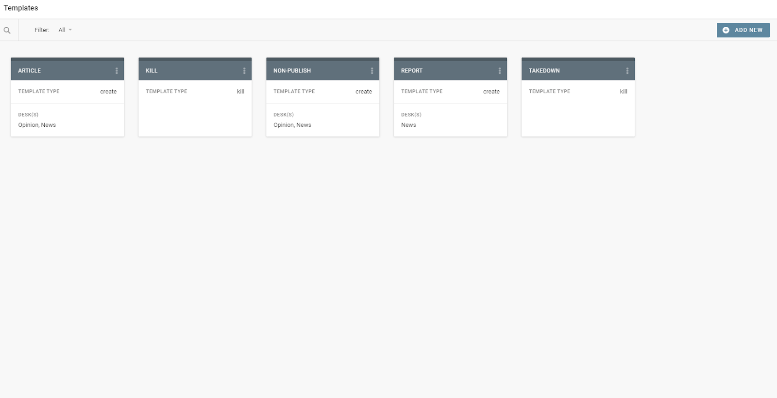
One of the main ways that Superdesk automates the newsroom workflow is through its robust template system. Major content forms — such as news articles, op-eds or updates on a major global index — can be templatized through this feature.
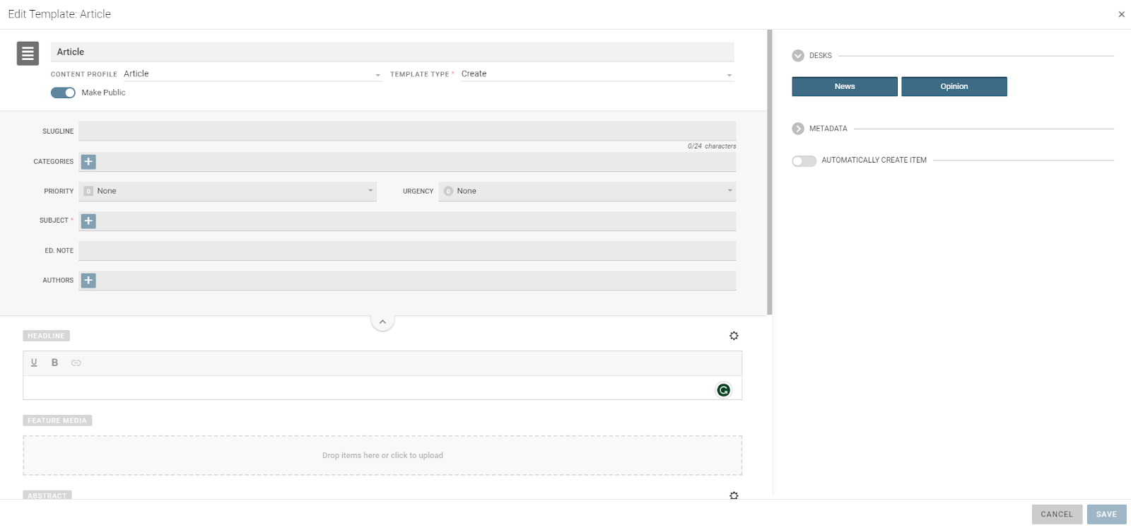
Templates can be edited in a wide range of ways. Headlines can be preconfigured to always appear in a set way and metadata can be adjusted and standardized. Moreover, templates can be sorted across desks, creating an organized and streamlined content generation system.
Other Features
Outside of the main features we’ve already talked about, we wanted to highlight a few of the platform’s other aspects that we felt were noteworthy.
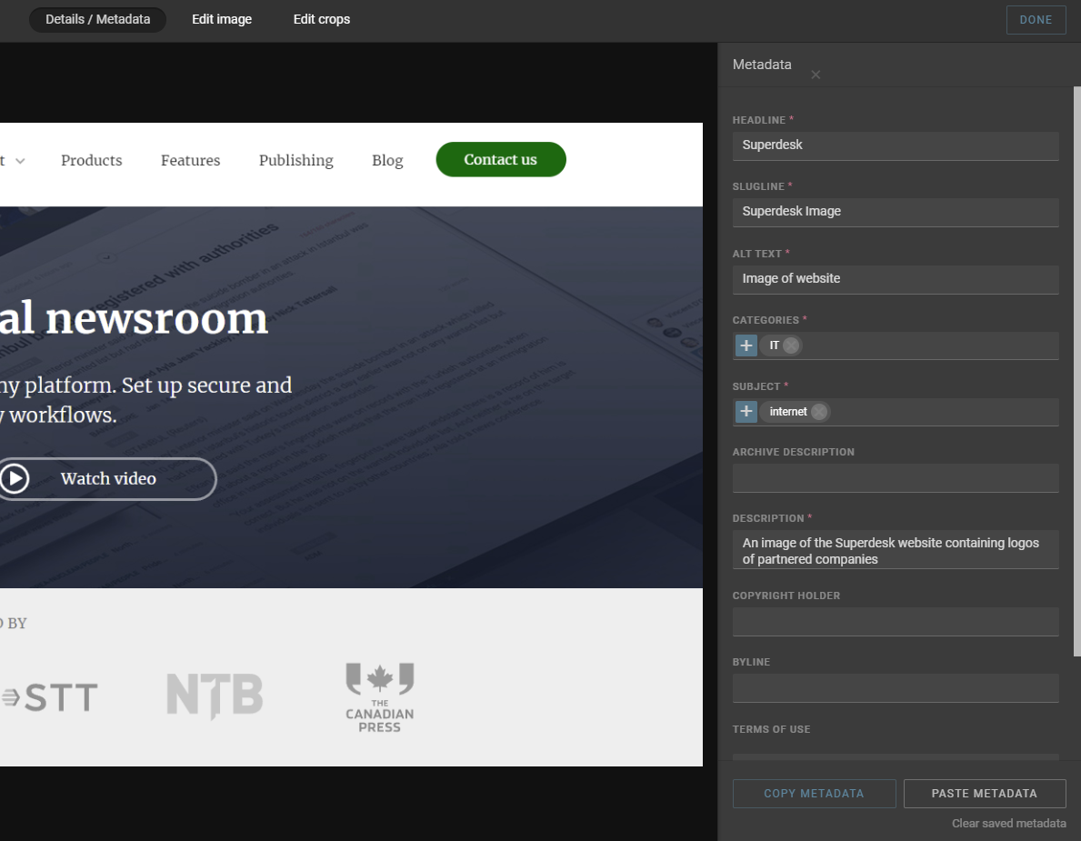
While content has metadata customization built into it, what impressed us was the fact that the program has the ability to copy and paste metadata. This is a small but useful time saver, as it slims down the time spent filling out metadata sheets, needing only small edits instead of a full write-up each time.
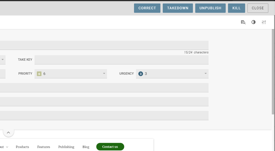
Secondly, the program allows editors to edit content after it goes live. Any content that is corrected after going live becomes highlighted in the monitoring window, which is useful for keeping track of content changes. The program also has an in-built feature to send takedown notices.
Thanks to its API structure and headless CMS functionality, Superdesk can integrate into other legacy systems and third-party applications — including image databases, semantic text analysis programs and other CMSs such as WordPress.
Help and Support
To be frank, Superdesk is a complex program — it’s not easy to maneuver around. At any given time, there are at least three different menus within different windows throughout the program.
Luckily, Superdesk has a range of documentation and guides to help onboard users to their platform. One resource that we found helpful when first getting to grips with the platform was their Superdesk guides on YouTube, which detailed some of the basic functions of Superdesk.
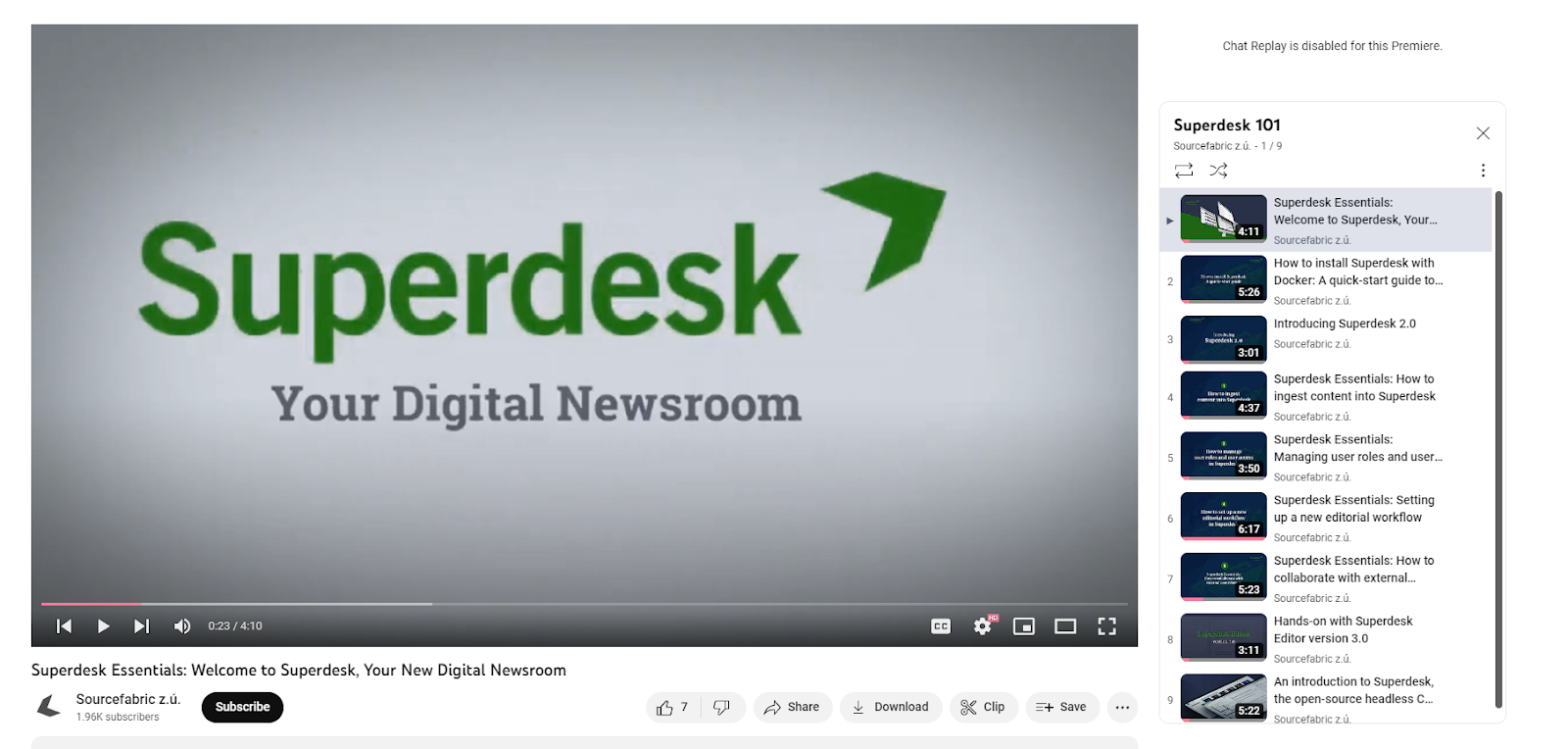
However, if a problem needs an in-depth solution, then Superdesk has offered its complete user manual. There’s a great deal of information here, more than 200 pages to be exact, and it’s commendable that Sourcefabric has rigorously detailed its features.
More importantly, however, is the fact that when it comes to onboarding first-time users, Superdesk offers live training. This boils down to two hours of training for the Lite version and six hours of training for the Pro version. While direct training will definitely help editors overcome learning hurdles quicker, we do wonder whether two hours is enough for less tech-savvy users. We do feel, however, that six hours should be enough for anybody, regardless of tech level, to comprehend the platform’s features and potential.
Finally, each version of Superdesk comes with a dedicated support line, which is definitely a necessity for such a complicated solution. Lite version users have their support restricted to office hours, while Pro and Enterprise versions have extended support hours.
The platform also comes with version control to allow developers to roll back any mistakes in the code.
Superdesk in Review
Overall, Superdesk is an impressive CMS with a lot of potential. It has a strong suite of tools for both journalists and editors and it’s particularly effective at monitoring the editorial workflow.
Our suggestions to the platform are two-fold: standardize certain platform elements to provide a more visually coherent workspace and make error messages more visually distinct. Despite some niggles with its design, the platform is a solid digital newsroom solution.
What We Love About Superdesk
- Provides a detailed, yet easily modifiable view of editorial output
- Robust text editor with fully realized media tools
- Easy communication between members using message tools
- Personal dashboard for organizing tasks and document management
- Allows content creators to adjust live content
- Fleshed-out metadata and content strategy tools
- Templatized and stream-lined content creation tools
- Ingesting from feeds and emails
- Strong user performance without much lag
Where There’s Room for Improvement
- Somewhat obtuse visual design
- Complicated onboarding process
- Text editor missing some features
Perhaps the biggest draw to the platform, and one of the most critical things that Superdesk does well, is its ability to provide a holistic overview of the editorial workflow and its capacity to work across articles.
Many of its features provide more accessible ways to work across, and keep track of, multiple articles. For example, multiple articles can be opened at once and are displayed in a line at the bottom of the window. Users can also easily swap desks from the top of the window, allowing them to organize content rather efficiently.
The platform’s Monitoring window is also useful for keeping track of an entire publication’s output at all stages of the process, which in itself can be organized into separate workflows.
Each item is easily identifiable and can be sorted through many different parameters such as author, which makes it an impressive resource for keeping track of an entire editorial platform. In that same vein, it is a great tool for assigning tasks to content creators, both in-house and freelance.
Although there have been some minor issues, the overall user experience of Superdesk has been smooth. While some Superdesk reviews have mentioned occasional platform malfunctions on its initial instance, we never experienced these problems during our demonstration.
Our biggest concern with the platform thus far has been the visual design of the user interface. The platform is definitely busy, and the amount of visual noise can, at times, obscure vital information. Take, for example, the text editor window.
To open this window, users need to navigate to it either through the Dashboard or Monitoring sections. However, the initial windows don’t disappear, encroaching on the editing space. There is a way to collapse these windows, but it’s not immediately clear how to do so.
The problem with this, as well as similar design decisions, is that the editing window does not operate on this same logic — it has its own dedicated minimize button. It’s not a natural design choice and forms a barrier to entry for new users.
Luckily, Sourcefabric does provide plenty of resources to help onboard its users and, once the growing pains have subsided, the platform proves itself to be a robust, streamlined CMS.
All in all, Superdesk has impressed us with its functionality and, despite some kinks, it has demonstrated its comprehensiveness and effectiveness as a digital newsroom.


