The publishing industry has, rightly or wrongly, earned a reputation for being slow to innovate. Despite the digital space’s boundless design opportunities, the sector has struggled to break free from its print design roots.
Many digital publishers’ design language continues to emulate either that of their print counterparts or the blogging sphere. Times are changing, however, with each new year seeing the release of tools that open up creative possibilities.
Among a rather broad field of digital publishing platforms, Joomag has distinguished itself by innovating within the publishing medium itself. The platform provides integrated solutions for publishers to create mixed-media publications, combining audio, video and interactive elements to craft interactive and engaging experiences.
And it does this while removing technical barriers to entry, leaving room for publishers of all skill levels to benefit.
Read on to discover what we experienced during our hands-on time with Joomag and see out what it brings to the table, the problems it solves and its limits.
What Is Joomag?
Joomag is a digital publishing and content experience platform that helps publishers and businesses create and deliver interactive publications, such as online magazines, as well as brochures, catalogs and more.
The platform can be used for digital publishing as well as corporate communications and the sales process. It comes loaded with an online editor, in-depth analytics suite, an email marketing tool, customer relationship manager (CRM) features and custom integrations. Joomag also offers a dedicated customer success manager, live-chat support, design services, tech consultations, and more.
Joomag does many things well, but one of its main draws for publishers is its ability to add interactivity to a digital publication. This not only means the inclusion of rich media such as GIFs, images and videos but also quizzes, forms and reports. For example, adding interactivity is a great way of breathing new life into evergreen content.
While interactive assets can certainly create a more immersive experience, fostering engagement and helping to improve reader retention rates, these elements also serve a strategic function. Joomag’s interactive assets can collect valuable analytics data from each reader’s interaction, providing detailed insights at the individual level and allowing publishers to better understand audience behaviors and preferences.
Joomag even allows publishers to add web widgets to create custom experiences for their digital publications.
There are three steps to using Joomag:
- Build a publication from a template, from scratch or from a PDF
- Add interactivity to a publication for heightened engagement
- Distribute and monitor publications.
Before exploring the platform’s full feature set, one aspect of Joomag’s content creation suite we wanted to draw particular attention to is its mobile compatibility. Joomag can automatically detect when a publication is opened on a mobile device and adjust and optimize it for that device. Editors can also customize or adapt publications for mobile to ensure that the format will work and is stylized correctly.
These are compelling features, given global internet users’ preference for mobile web browsing.
Joomag’s Pricing
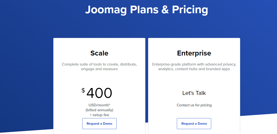
There are two ways to access the Joomag platform. The first is via its Scale tier, which costs $400 a month excluding VAT (plus a setup fee) and includes the magazine editor as well as SEO tools, a custom domain, email marketing, the CRM and a scaled-down version of the analytics module.
The second option is the Enterprise tier, which features more tools for managing multiple different publication brands, custom integrations, enhanced privacy options, more advanced analytics tools (such as behavioral and acquisition data) and individual insights.
Getting Started With Joomag’s Dashboard
A publisher’s first encounter with Joomag will likely be with the editor, which is one of the magazine’s mainstay features.
From the left sidebar, publishers can use the book icon to maneuver their way to the My Publications window.
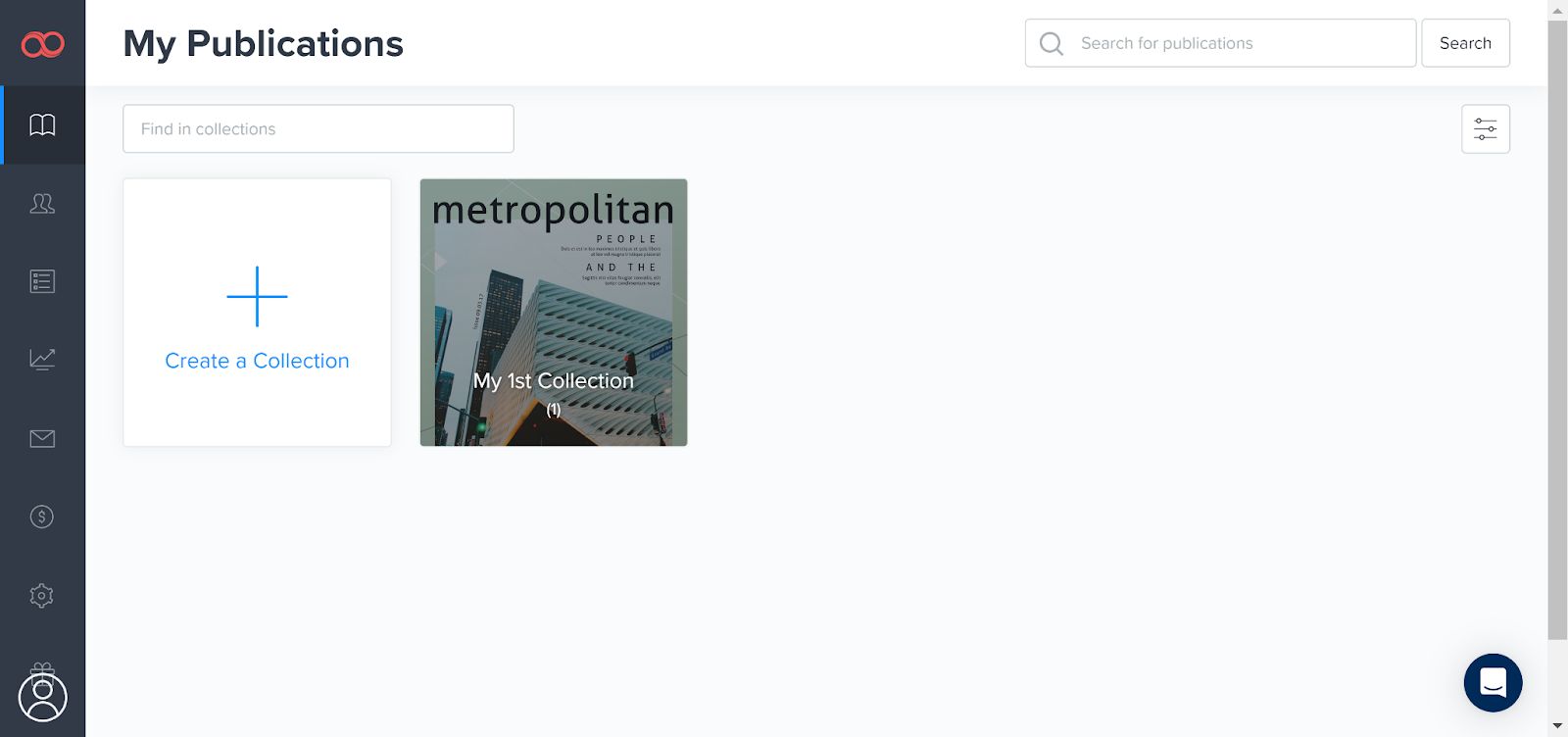
From here, they can access their various publications, sorted by collections. Publishers with an Enterprise subscription can sort by subsidiaries and sister companies for an added level of organization.
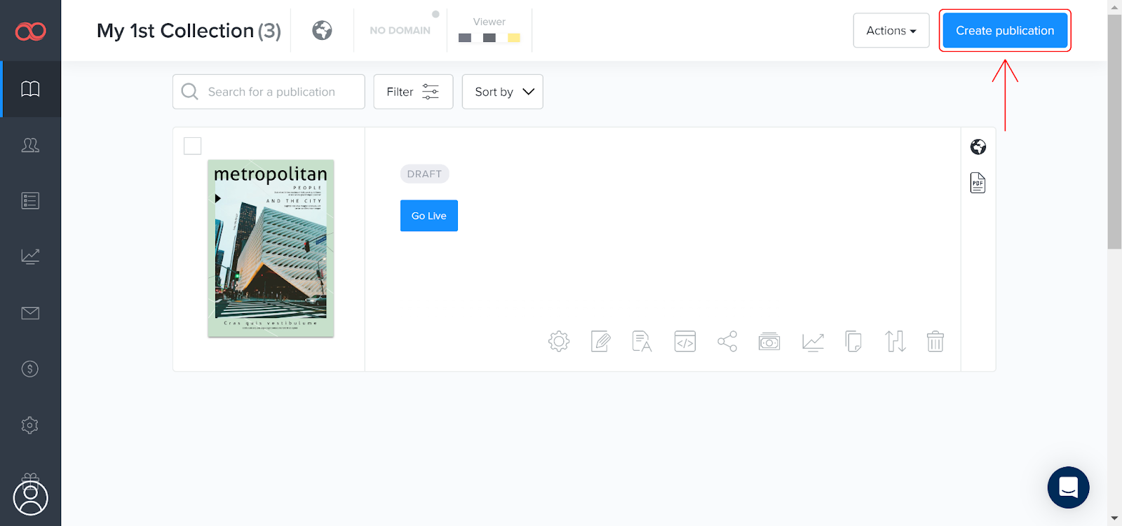
From here, users can click into the collection and view individual publications/issues. The “Go Live” button can be used to publish the magazine so users can access it on the viewer. Publishers can use the “Create publication” button at the top right of the window to start building a magazine.
Joomag gives publishers three options for creating a publication. They can import a PDF, which is useful if the publication has been designed in or typeset in Adobe InDesign or similar programs. Publications can also be created from scratch or from one of the more than 300 high-quality templates.
Once the user has picked an option, it’s then on to the editor.
Publication Editor
As we can see below, the toolbox’s editor appears on the far left and details of individual elements appear on the right. Once the page margins have been defined, any elements that occur outside of those margins won’t appear in the viewer, which is both something to be aware of and something that publishers can use for their benefit.
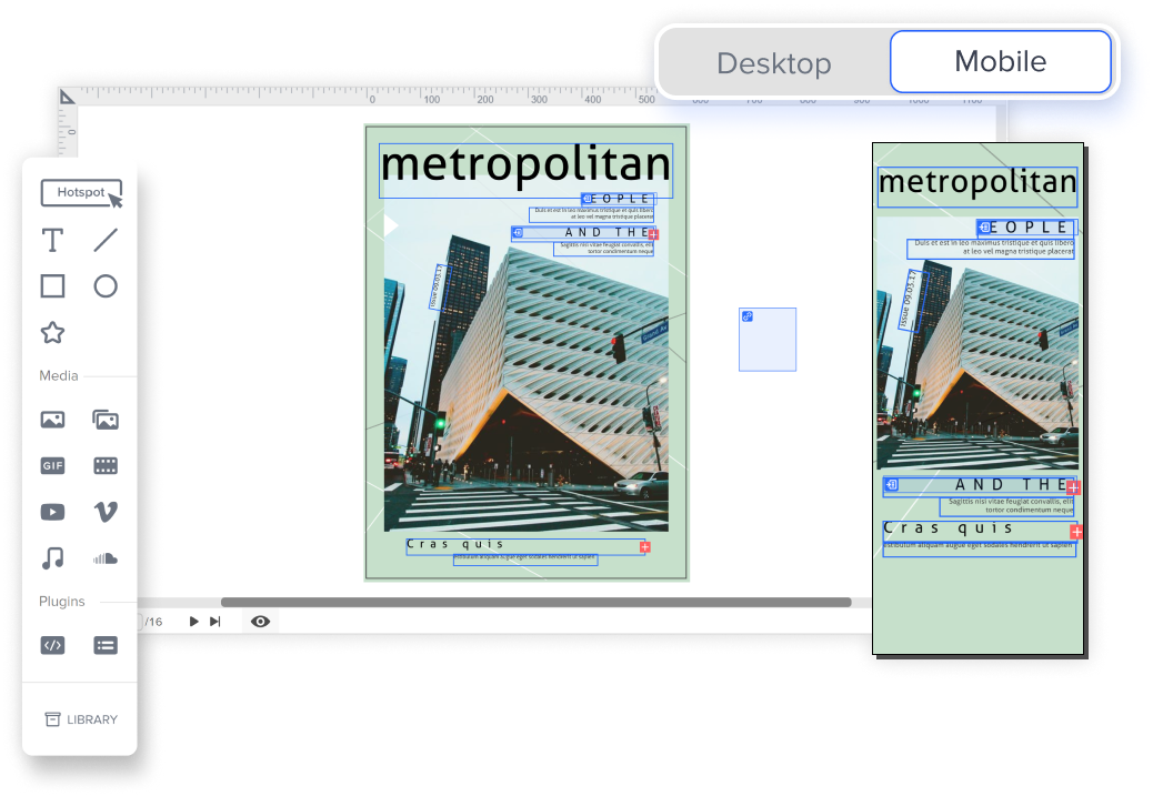
Editor’s Note: This view of the toolbox is not representative of actual size. The image has been increased for clarity.
For example, in the template Joomag provided rectangles have been used to express a gradient and as eyelines
There are some standard image editor tools here, such as options for adding text, lines, shapes and images. Moreover, there are a few options that are rare in other publishing platforms.
GIFs are a form of rich media that can be added, as well as native video or videos from host sites such as YouTube and Vimeo. Videos can also auto-play and pop out from their frames, though the autoplay won’t function in Chrome if the videos don’t meet Google’s guidelines. Audio can also be added natively or linked to from the Soundcloud platform.
More interesting still are the hotspot button and the HTML plugin. Publishers can set up hotspot buttons to link readers to specific pages of their publication and external sites. The HTML plugin, meanwhile, allows publishers to integrate javascript directly into their publications, which could provide many different applications.
An example would be to have text boxes expand when clicked to deliver additional information. Another would be an interactive graph where users can alter how data is viewed in real time.
While using the editor was mostly smooth sailing, its system for managing different layers can, at times, hinder the experience, especially when pages become a touch noisy. There are four layering options available for publishers:
- Layer down
- Layer up
- Send to front
- Send to back
What’s missing here is a concise view of all the layers, which can sometimes make it a little difficult to edit neatly, as it becomes hard to determine which layer holds which element. For example, it can be a bit of a time sink to position a shader or a text box in the right place because it’s not always obvious what it’s hiding behind.
While this is definitely a nitpick rather than a deal breaker, it would be nice if these sections were easier to read.
The clear standout, however, is the platform’s streamlined accessibility. Integrating rich and interactive media into this platform doesn’t take much effort — it just works and looks professional.
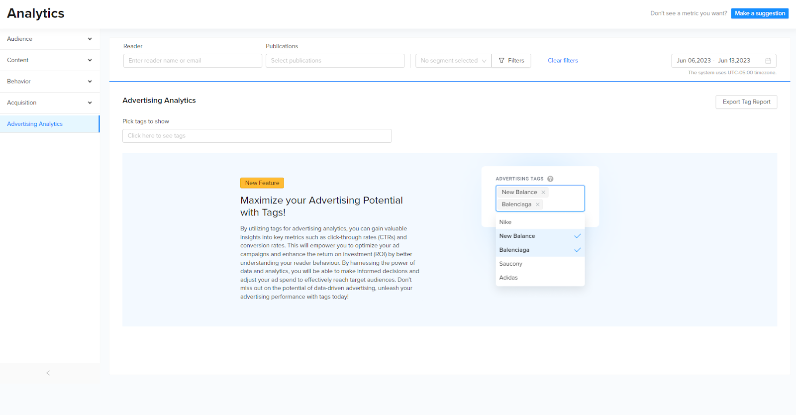
The last thing to highlight in the editor is the advertising tags, which publishers can use to collect data on viewed ads and provide detailed, accurate impressions to their advertisers. It’s a useful tool for organizing and keeping track of data, which can be viewed in Joomag’s analytics section. The tags can differentiate between different advertisers, separate data from individual publications or congregate it across collections.
Advertisers want as accurate a view of impressions as possible, and this feature raises the publishers’ bargaining power by optimizing their revenue through strict bookkeeping.
Using the editor’s preview button opens up the Joomag viewer, which lets the user see how the audience will view the publication once it goes live. The arrows on the side of the pages can be used to maneuver through the issue.
Text here can be underlaid with buttons that can also link to their relevant pages. Looking at the below image, for example, we can make it so that clicking on the “Interview with Exports” box will take the audience to the interview.
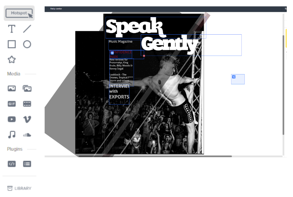
Editor’s Note: This view of the toolbox is not representative of actual size. The image has been increased for clarity.
Joomag also has a Mobile version editor that allows publishers to optimize either the whole publication or select pages for mobile viewing. It works both when importing PDFs and creating publications from scratch.
Most of the interactive elements tend to be located within the page itself, with one notable exception — the feedback form. This is located at the right margin of the window itself. User feedback can be set up for audiences to rate, leave comments and direct feedback for the publication as well as individual pages.
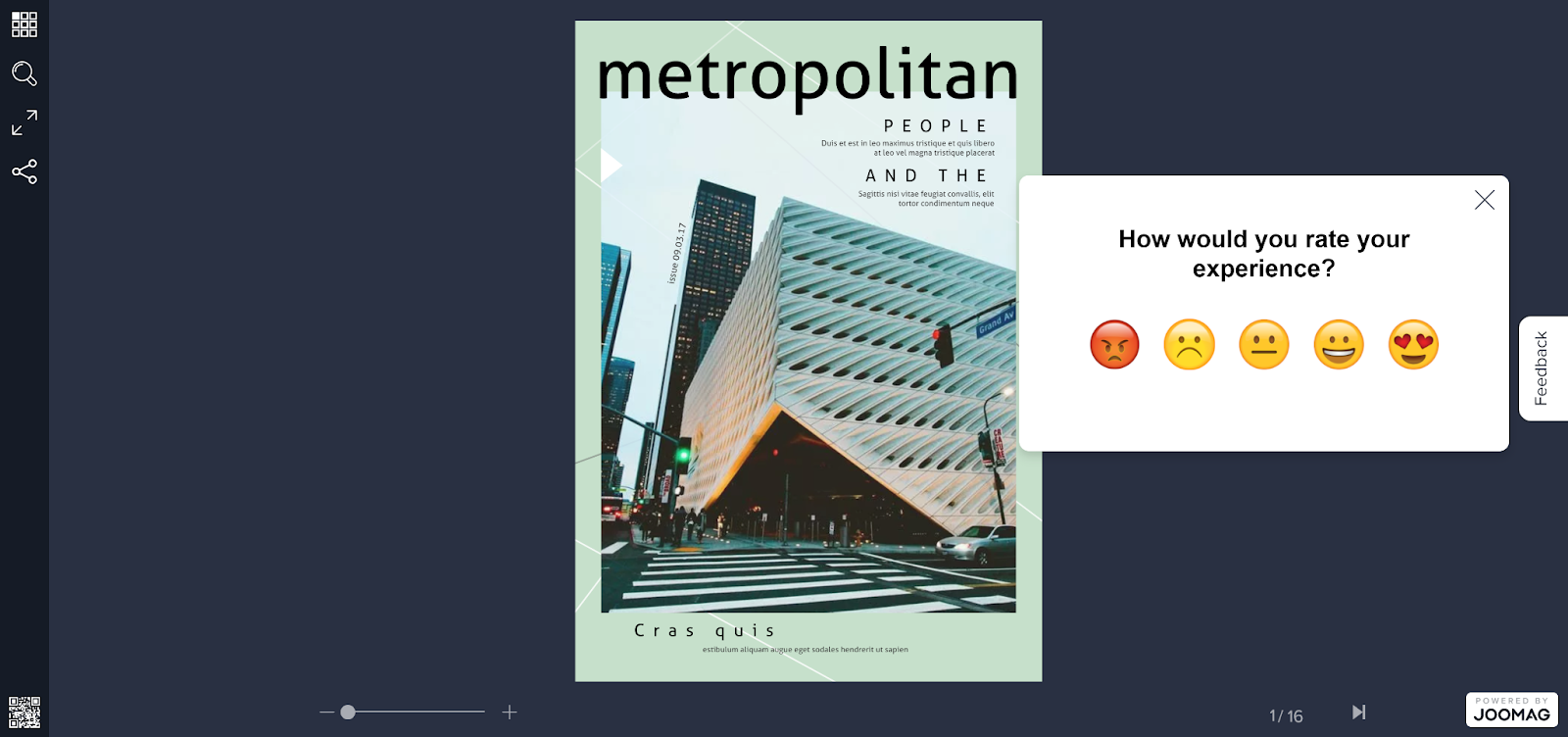
Our time with the editor showed this to be a smart, streamlined and competent magazine creation tool. Indeed, much of the platform’s individuality comes from the ease with which interactable elements can be inscribed into publications.
Next Steps With the Dashboard
Once editors and publishers get to grips with the publication creation, editing and managing tools, the next step is the publishing back end. Joomag’s email marketing, analytics and CRM tools help publishers market, strategize and distribute their publications.
Email Marketing
The email marketing tool is where publishers can outline their sales engagement strategies and distribute their digital magazines to users that have opted-in. It can be accessed by clicking on the email icon on the sidebar.
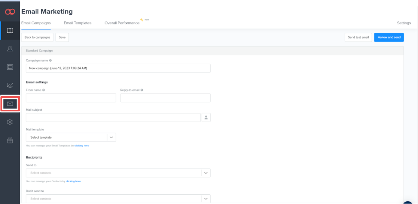
The email content marketing software also measures campaign performance, tracking metrics such as how many people opened the email and the number that read the publication.
Once a campaign has been created, editors can adjust the settings and add bylines. They can also make and organize multiple send lists and select the relevant ones from the dropdown tab.
The platform also has an email template system, pictured below, with quite a few different options to choose from.
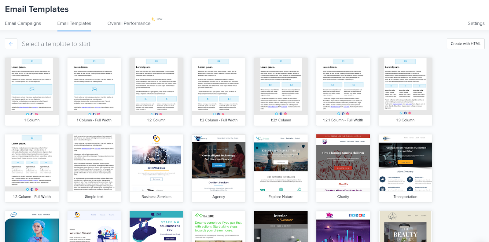
Emails that Joomag sends contain an automatic sign-in feature that lets the audience access the magazine with as little friction as possible. Publications can also appear inside the email itself.
Analytics
Joomag’s analytics section is another stand-out feature, breaking down a wide range of data to provide several interesting insights. Publishers can navigate to this window by clicking on the icon of a chart on the sidebar.
The analytics software not only tracks the total user numbers but can also segment returning users while providing their geolocation and the device they used.
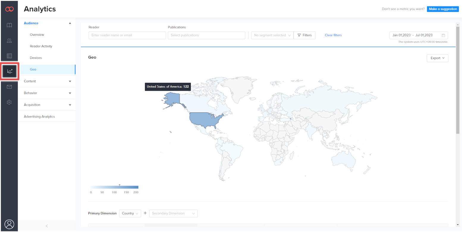
One of the more insightful pieces of data comes from reader activity and content performance. Joomag can track page-by-page user engagement and session duration.
While the average spread of user engagement decreases linearly as readers move through pages, Joomag can identify which pages seem to generate interest past the typical drop-off. By identifying these out-performing pieces of content, publishers can rearrange their publications and move this content forward to attract more eyes to it and enhance its performance even further.
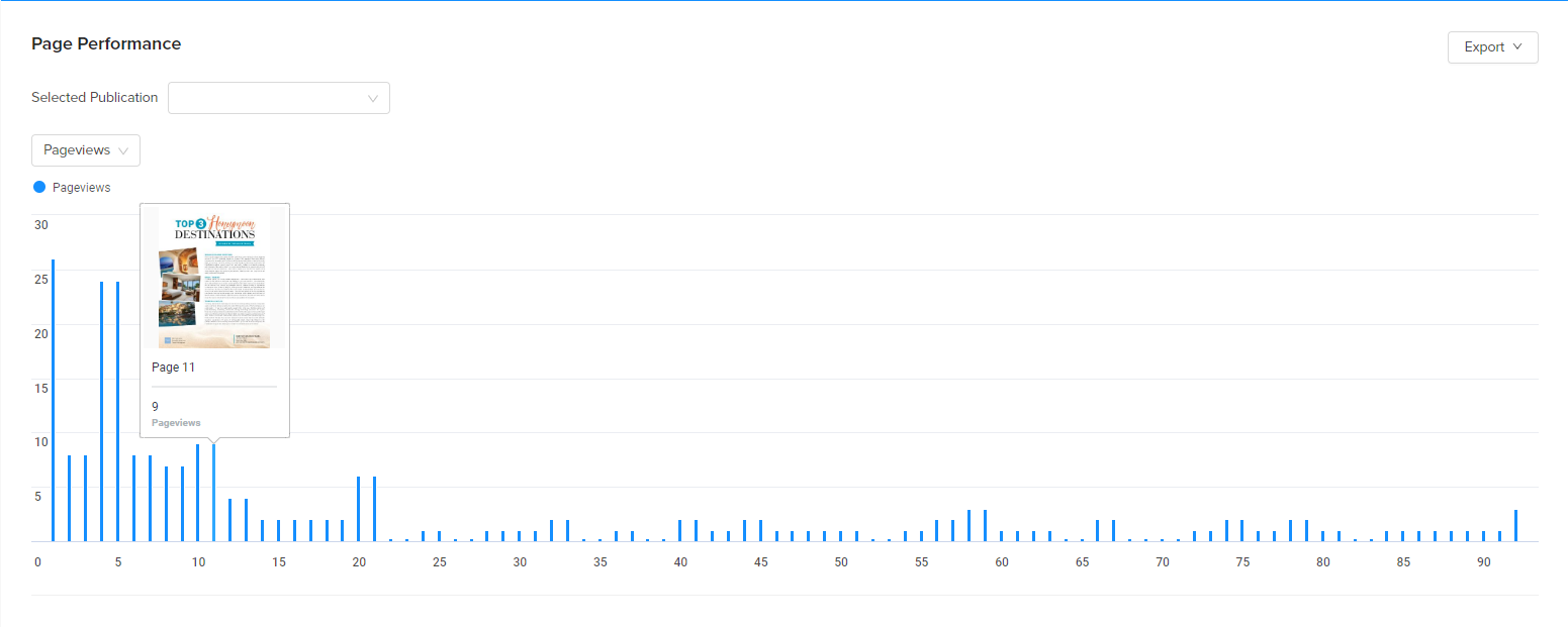
The same content performance and user behavior can be broken down into the individual elements of a page. Publishers can secure a full breakdown of individual plays of video and audio content as well as the number of downloads a publication receives. Importantly this feature also provides insights into individual reader engagement levels, with publishers able to track the elements — clicks, video views, pageviews, etc. — that engaged each reader the most.
The analytics window is also where publishers can view data on advertiser tags.
Forms
Returning to forms, while they’re added to publications via the editor window, Joomag users first define them through the form window.
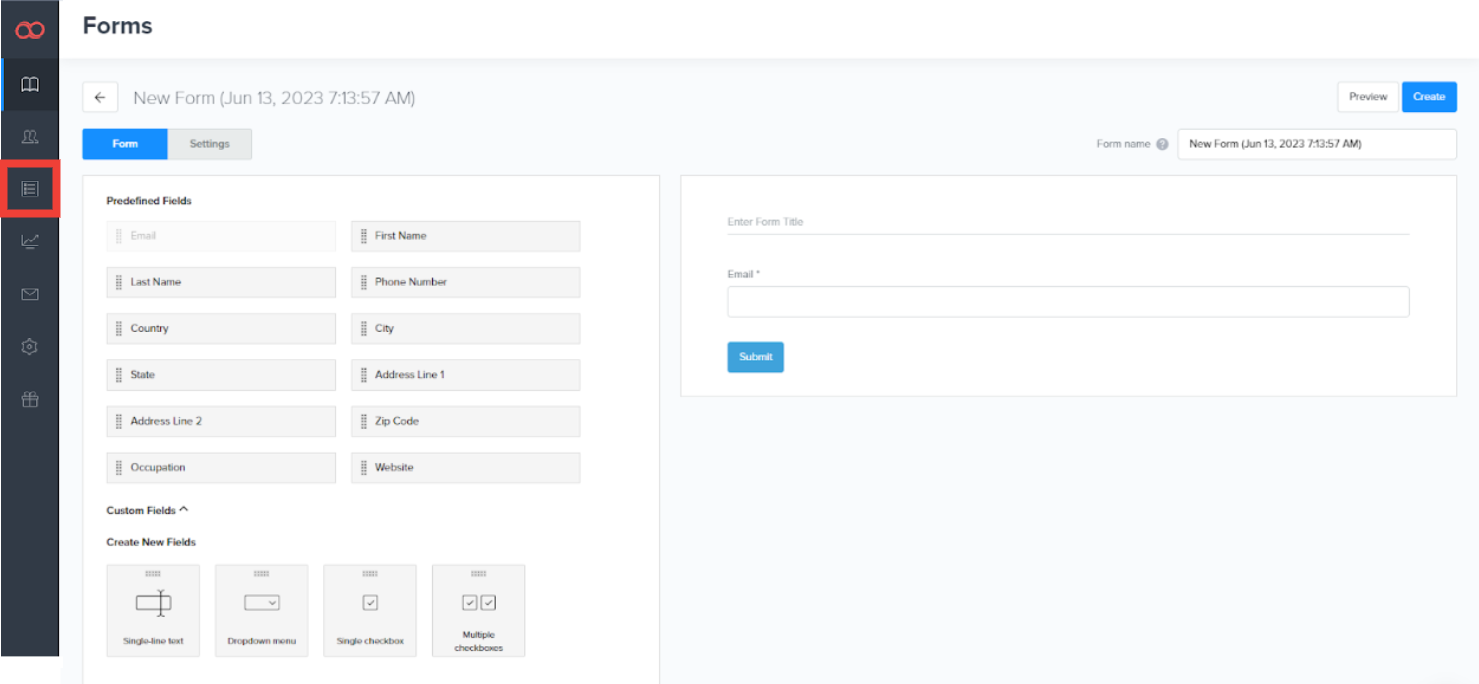
With Feedback forms enabled, publishers can receive reactions and comments in individual articles or the overall publication. This is valuable market research that can provide a snapshot of audience sentiment.
It’s a fairly sleek feature with a few different customization options that allows text boxes, dropdowns and checkboxes. Multiple forms can be created and edited for different publications and forms can be set to appear on any page inside the magazine.
CRM
Finally, Joomag’s last section is the CRM, which is quite frankly a bit thinner on the ground than many of the platform’s other back-end features.
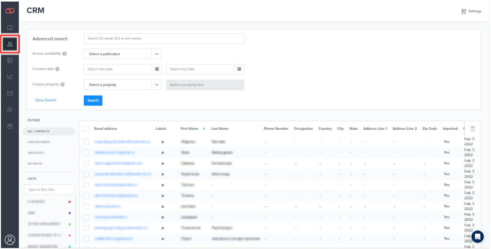
While a little on the bare side, it’s still a functional way to store customer data and opt-ins. Although it would be nice to see a more fleshed out CRM solution, Joomag does integrate with major CRM solutions and subscription management systems, such as Salesforce.
Help and Support
The Joomag platform is fairly streamlined and accessible, without a great deal of complexity that would extend the learning curve. Even so, Joomag does have a help center, a dedicated support team and tutorials on various platform features.
That said, we’re confident that because of the program’s shared design language with similar software, users should be able to find their feet relatively quickly simply by exploring the dashboard. Users without design experience should be able to use the platform to create a magazine with relative ease, especially when borrowing from Joomag’s template system.
In terms of bugs or any other technical errors in the platform, we never encountered any during our hands on. Joomag is smooth to use and is generally lag free. Very occasionally, entering and leaving the viewer took longer than usual, but whether this was the fault of the platform or a local internet issue is impossible for us to say.
Overall, we found it to be a trouble-free experience.
Joomag in Review
Joomag is a well-rounded, tightly developed digital publishing platform with a great many positives. While it does have some room for improvement, the platform issues fall more on the nitpick end of the spectrum.
What We Love About Joomag
- Streamlined, easy-to-use publication editor
- Mobile optimization features
- Seamless integration of interactive elements
- Great email marketing tools
- Great range of analytics
- Comprehensive advertising tag system
- Embedding/viewer system saves room and feels visually coherent
- Joomag’s visual design is intuitive
Where There’s Room for Improvement
- The layering system needs a little more detail to be cohesive
- The CRM is more stripped-back compared to other platforms
Joomag has, undoubtedly, achieved what it set out to do. The platform’s easy to learn and create professional-looking publications, and it’s adaptable to many different workflows. Publishers will still find the platform useful even if they choose to ignore the editor entirely.
However, Joomag’s focus on streamlining some of the online publication processes does come at the expense of its level of depth compared to some other platforms. The layering system is a good example here; the simplistic design hampers its ability to edit as keenly as InDesign and similar programs.
That said, we were impressed by how efficiently interactive elements can be inserted into digital publications. The trade-off between streamlining and complexity ultimately works out in Joomag’s favor. Couple this with a diverse suite of comprehensive analytics and a great distribution system, and the end result is a cohesive and holistic publishing platform with plenty to offer.


