Rosamund Pearce is a multimedia journalist for Carbon Brief.
What led you to start working in digital/media publishing?
I wanted a job where I could be creative, where I could keep learning new things, and where I would have something new to do every day. After I finished my degree, nothing I looked at seemed to offer this, so I decided to do a master’s degree in Science Communication (a journalism master’s for science graduates) while teaching myself the Adobe Creative Suite. I produced a few infographics for the student newspaper while I was there and discovered that I was quite good at it.
What does a typical day look like for you?
Around once a week I have an early start. The journalists at Carbon Brief take it in turns to write our daily newsletter, which involves starting work at around 6:30 or 7:00 and writing summaries of the most important climate change stories of the last 24 hours. If it’s a busy news day this can be a pretty demanding task! And since the email goes out automatically at 9:00, it can be very unforgiving if you’re running short of time. Like many media organizations, we have a morning meeting to determine what we’re going to focus on. From there on I don’t think I have much of a ‘typical’ day. If I’m building an interactive map or visualization I can spend a whole day writing Javascript — or trying to work out why my code doesn’t work. Other days can be spent in Adobe Illustrator or After Effects if I’m animating something. Sometimes I’ll accompany a colleague to film somebody we’re interviewing. We’re a small organization so I do a bit of everything.
What’s your work setup look like? (your apps, productivity tools, etc.)
Trello has been a revelation! I often have lots of different files for any given project, so it’s a useful way keeping track of everything. I like to add images or links to things that inspire me, or examples of code that I think could be useful.
As a team, we use Slack, Google Sheets and Docs, and Dropbox. Not particularly groundbreaking, but this setup means that I if I’m working from home or on a trip, I still have all my files at my fingertips.
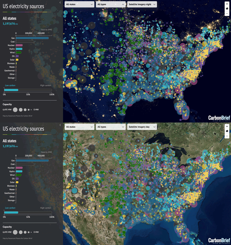
For my multimedia work, the list of tools I use is pretty long; I actually have a spreadsheet to keep track of them. Some of the most useful are: the Adobe Creative Suite, Open Refine (for cleaning up data), Visual Studio Code (a text editor with lots of useful extras), GitHub, D3.js, Leaflet.js, Tableau. For example, I made this interactive map using most of the tools I just mentioned:
What do you do to get inspired?
There are a few people whose work I always admire: Nicholas Felton, who creates beautifully designed visualizations about the minutiae of his day-to-day life, Kiln, who make ambitious interactive maps, and Vox for their animated video packages, which are deservedly popular. Otherwise, I find award sites like the Malofiej and the Information is Beautiful Awards excellent places to browse work by talented people.
What’s your favorite piece of writing or quote?
To be honest, I’m not that keen on inspirational quotes, and can’t understand their popularity on places like Instagram, but I make an exception for anything written by Oscar Wilde.
What is the most interesting/innovative thing you have seen on another outlet other than your own?
It’s very hard to pick one, as there seems to have been an explosion of great multimedia features ever since The New York Times published their famous Snowfall article. So I suppose I’d have to choose that, as it’s had such a huge influence on digital journalism over the past five years.
What’s the passionate problem you are tackling at the moment?
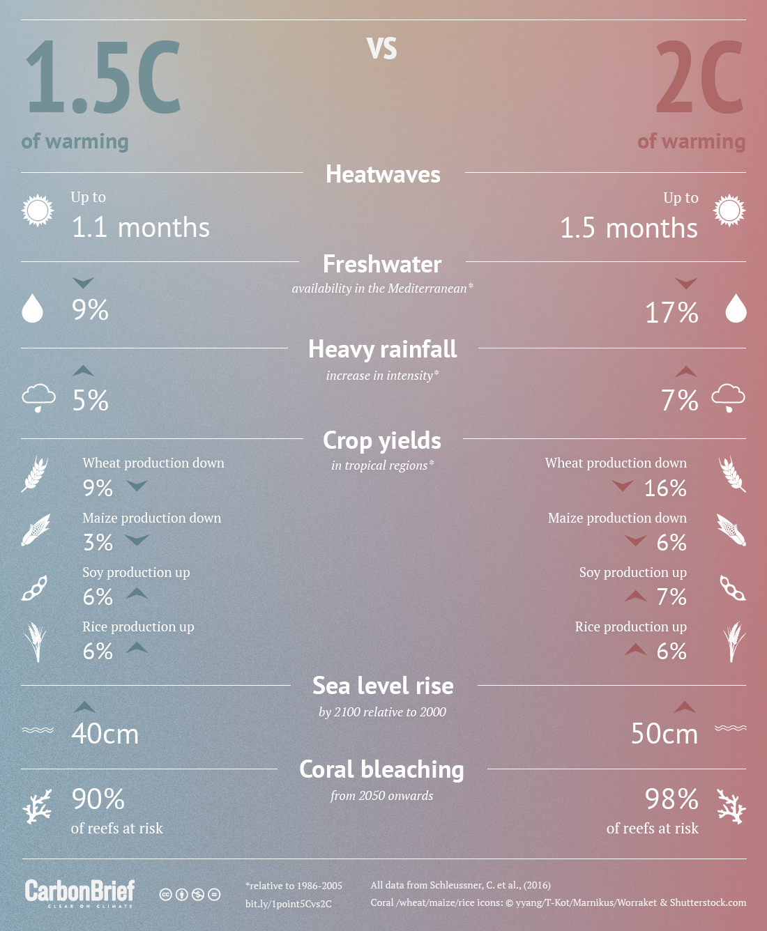
Creating interesting dispassionate and apolitical content. We’re not a tabloid or a campaign organization, it’s not our style to draw people into our site with stories designed to provoke emotion or outrage. We’re factual and policy-neutral. But this can be a bit of a problem for us, as it’s emotive and controversial content that tends to be widely shared online. Instead, my approach has been to design visually appealing content like infographics to get our articles noticed, which is something that we’ve since become known for.
Content from our partners
Over the past few years, we’ve also started using more interactivity and animation in our data-led stories. Our articles don’t shy away from the science, and animation can be particularly useful for walking the viewer through a graph or concept that might at first appear daunting to a non-specialist. By creating a linear narrative and feeding the viewer information piece by piece, technical ideas become easier to digest.
Do you have any advice for ambitious digital publishing and media professionals who are just starting out?
The majority of the skills I use day-to-day in my job were self-taught. That’s not to say I mastered them overnight (and many remain a work in progress!), but it’s worth knowing that it’s possible to teach yourself things like coding, mapping and data scraping using only online resources if you’re willing to invest the time. And it’s becoming increasingly desirable for journalists to have these kinds of skills. The Knight Center for Journalism in the Americas runs interesting online courses periodically, which are well worth investigating. If you’re a woman or a member of a minority group and want to learn to code, then I recommend Codebar which helps underrepresented people learn programming.


