Publisher growth tactics for election season | WEBINAR


A call-to-action (CTA) prompts and instructs users to take action, such as visiting a post, sharing contact information, subscribing to emails, downloading an e-book, or making a purchase. They are displayed in the form of a text link or button. When clicked, CTAs take the user to a desired landing page to complete the action. In some instances, CTAs can also be plain text with no links.
The most common CTA phrases include –
CTAs can be lengthy, for instance, “Subscribe to our newsletter to never miss an update.” However, industry experts suggest keeping the CTAs brief and relevant to readersjourneys to maximize click-through rates.
The below-shared CTA on the leading American online publication Task & Purpose, which says “Sign Up Now!” is a perfect example. This action-oriented and engaging CTA inspires the readers to take action.

Follow these fundamental guidelines to provide better content usability to users. This can help boost audience engagement.
Strategically placed CTAs can help the website appear more structured. They can grab visitors’ eyeballs to the essential details, such as crucial sections, subscription forms, products and services, offers, and more.
In short, CTAs allow visitors to locate vital elements on a page quickly, offering a great user experience. This can help publishers contribute to boosting business revenue and sales in the long term.
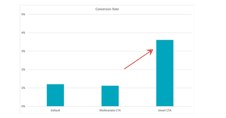
In fact, a recent study by HubSpot revealed that adding CTAs to content can accelerate conversions. Their team analyzed more than 330,000 CTAs over six months.
They categorized CTAs into the below-shared three major groups –
The result? HubSpot found that tailored CTAs convert 202% better than other versions. See the graph below to understand the difference.
Now that you’ve understood how CTAs can help boost conversions, let’s explore their best placement practices.
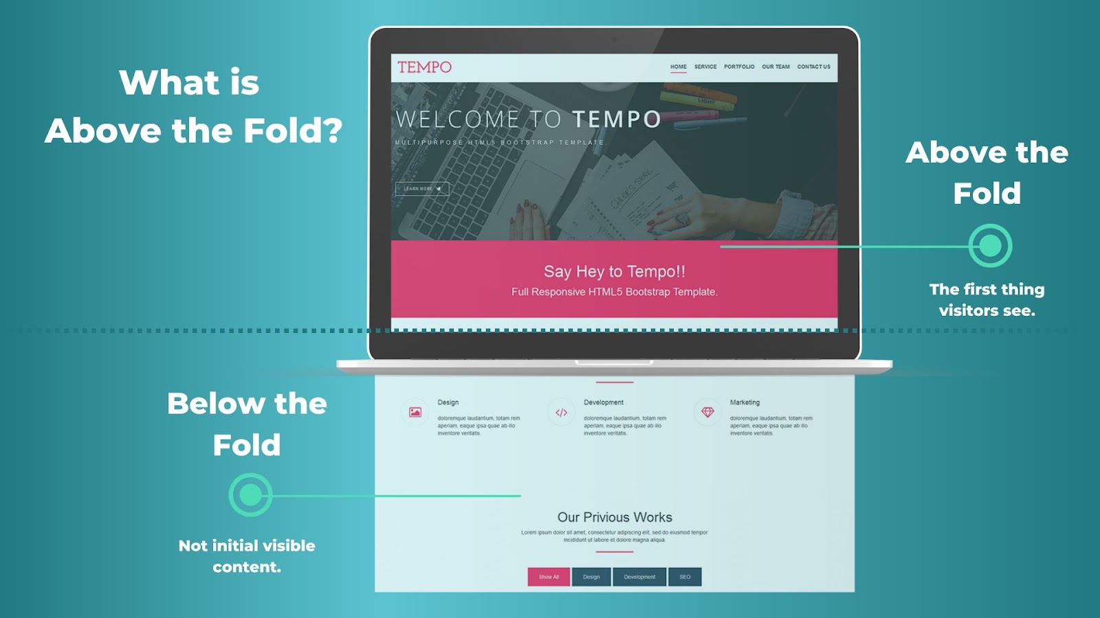
What does “above the fold” mean?
Here, the fold relates to the scrollbar. So, “above the fold” reflects the content you see at the first instance on the screen without scrolling. On the other hand, the content which is not visible at first glance and requires scrolling is “below the fold.”
There is a myth that says that CTAs placed above the fold can bring adverse outcomes for SEO and Google search ranking. However, it’s false.
You can put the CTA above the fold. However, ensure that CTAs are short. Lengthy CTAs can be misinterpreted as ads.
Here’s what Google’s Search Advocate, John Mueller says –
“I remember writing a story about how some large CTAs can be seen as ads and thus the ad pushing down the primary content of the page and thus it may be impacted by the old page layout algorithm. So maybe it is coming from there? But again, normal CTAs are fine.”
As we discussed, CTA is a strategically placed statement on a landing page to get immediate readers’ responses. It serves as a command to the user to click a hyperlink or button to engage with your website.
The key tactic to optimizing CTAs is to present them at the right moment when your visitors could be interested in taking the next steps.
Think about it – if your website visitor stumbles upon a CTA before any valuable insight, will they click on it? They won’t. So, ensure you share insightful content preceding the CTA link or button.
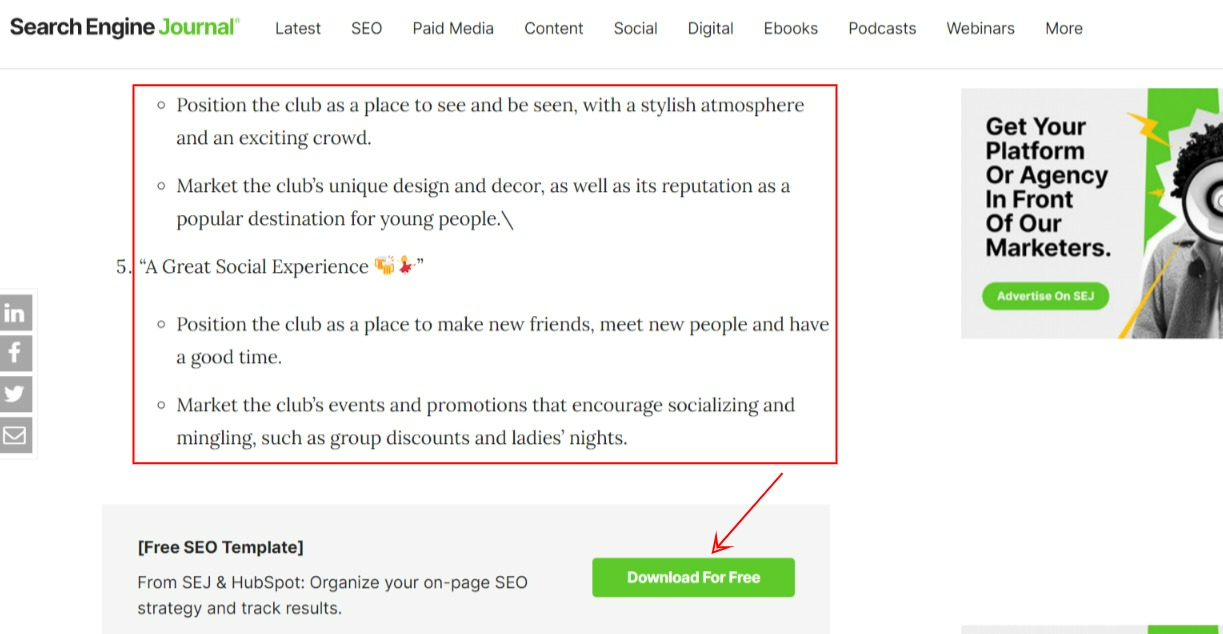
Check out how Search Engine Journal leverages this tactic.
Here are a few more crucial CTA optimization tips to consider.
Initial Website Research
Check the CTAs on your website for relevance. Track the CTA performance metrics, such as click-through rate (CTR), views, conversions, and more. This can help you identify what works for your target audience.
Competitor Website Research
Audit your competitor’s CTAs. Do thorough research to discover the latest trends in crafting CTAs. This can help you draft effective CTAs. That said, you should not follow their strategy blindly. Experiment with different CTA formats and notice user behavior. Track the conversion rate to build a winning CTA strategy.
Craft Your CTA
Now that you know what works for your audience and the CTAs your competitors are leveraging, you can start creating and testing them. As a bonus tip, we suggest you implement the below-shared ideas.
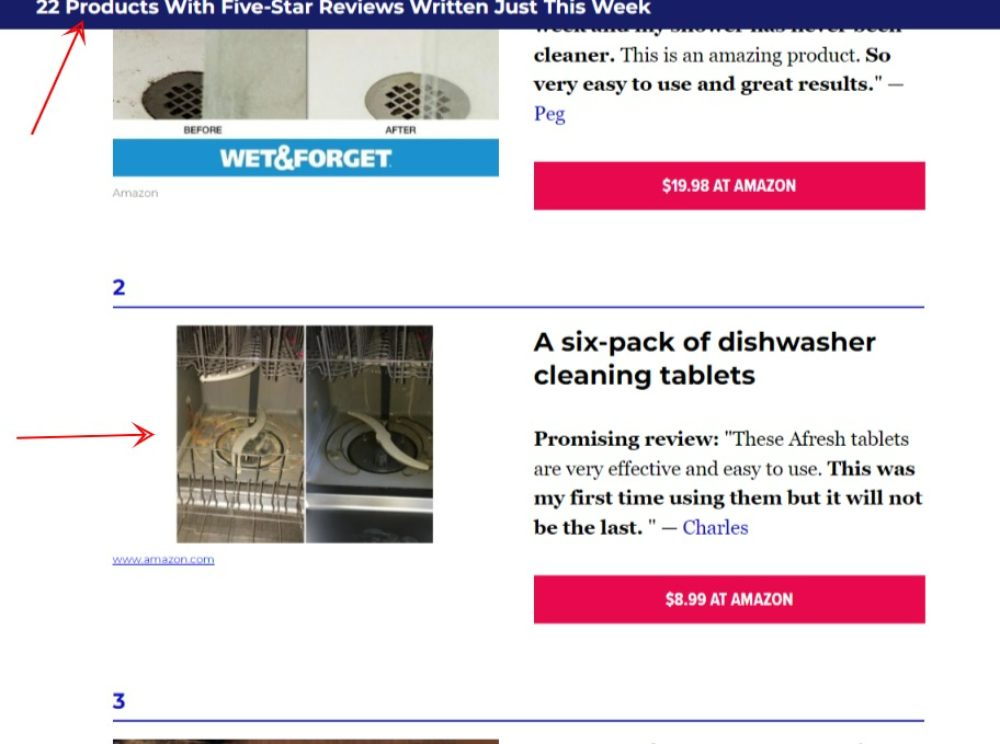
Check out the following CTA on Publishers Weekly.
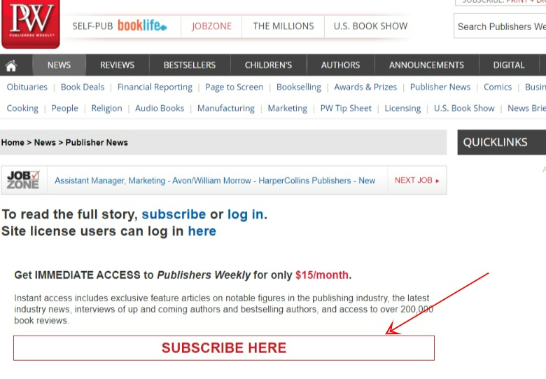
Here, the publisher has used “Subscribe here” to inspire the user to get access to the latest articles and news. Using something like “Click here to know more” may not be effective in such instances.
Focus on the Design
No one will read the CTA if its design isn’t eye-grabbing. So, make sure to implement the best design practices. Include colors that align with the website theme and make the CTAs stand out.
Notice the below-shared CTA on MarketWatch’s landing page. The design and color theme of the CTA enhance its appeal.

Pro Tip: Perform A/B Testing
A/B testing can help you test multiple CTA copies in terms of their color scheme, placement, size, and more and find out which has the potential to maximize conversions. Count on A/B testing platforms, such as VWO Testing and Unbounce, to offer the best user experience and enhance CTA conversions.
CTA can serve as a signpost that allows users to know what they should do next. Without a clear and actionable CTA, the visitor may leave the website without taking action. This can lead to the loss of valuable leads. On the other hand, well-drafted and designed CTAs can help publishers encourage their readers to sign up for a newsletter, read more posts, and support revenue goals.
For example, if a visitor lands on your top-performing article without a CTA, they will likely leave the site without taking action. However, the users can sign up for the newsletter if they find a CTA on the page asking for it. This, in return, will nurture your relationship, thereby boosting the chances of lead generation and conversions.
In short, CTAs move the prospect down the marketing funnel and assist in the lead generation or buying process.
Now that you are familiar with the significance of CTA and its best optimization tactics, let’s move on to the top aspects to ensure a click-worthy CTA.
1. Devices: According to Statista, around 50% of website traffic comes from mobile devices. So, optimize your CTA for mobile devices, including smartphones, tablets, and more.
Here’s an excellent example by HuffPost depicting a mobile-optimized CTA.

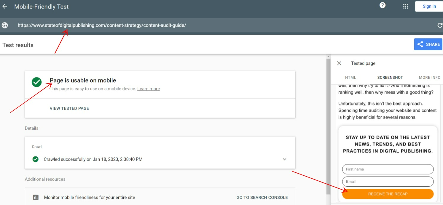
Pro Tip: Leverage Google’s Mobile-Friendly Test platform to check your page’s responsiveness (including the CTA). Enter the page URL and submit to see real-time results.
Observe how we tested the responsiveness of a page.
2. Colors: As we already mentioned, CTA color is vital to enhance its appeal. So, choose a mix of suitable colors that make the CTA worth clicking.
Check out how IOD, a technical publisher, uses bright orange-colored CTA to attract user attention.

Pro Tip: Use contrasting colors to grab users’ eyeballs. The example shared above uses this tactic. In addition, perform A/B testing to identify the best design for your target audience.
3. Placement: We already discussed why the CTA needs to align with the page’s content and should be placed strategically after relevant content.
Another crucial aspect to understand here is if the CTA is placed on a modal window (lightbox), ensure that the user returns to the main content after completing the action.
Notice how Search Engine Journal displays CTA on a modal window. It goes away when the user clicks on the “close” and allows readers to continue reading the content.

In short, the CTA should not cause friction between readers and the page.
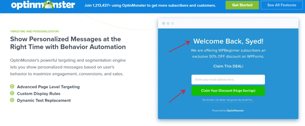
Pro Tip: Deploy OptinMonster to create compelling CTAs in seconds. Its powerful targeting and segmentation engine allows publishers to show personalized messages based on user behavior to boost engagement and conversions.
4. Web Visitors’ Behavior: Analyzing web visitors’ behavior can help publishers gauge their interests and actions. This can prove a game-changer in the CTA creation strategy.
Here’s how –
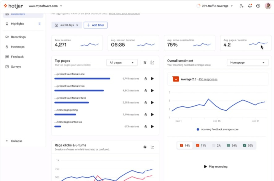
Deploy a heatmap and session recording software. This data visualization tool allows you to track web visitors’ real-time behavior on landing pages. For instance, the software shows insights, such as how long the users scroll the page, which page elements they click frequently, and more. We will share a few heatmap and session recording tools to ease your journey.
Before that, let’s understand how to leverage them effectively.
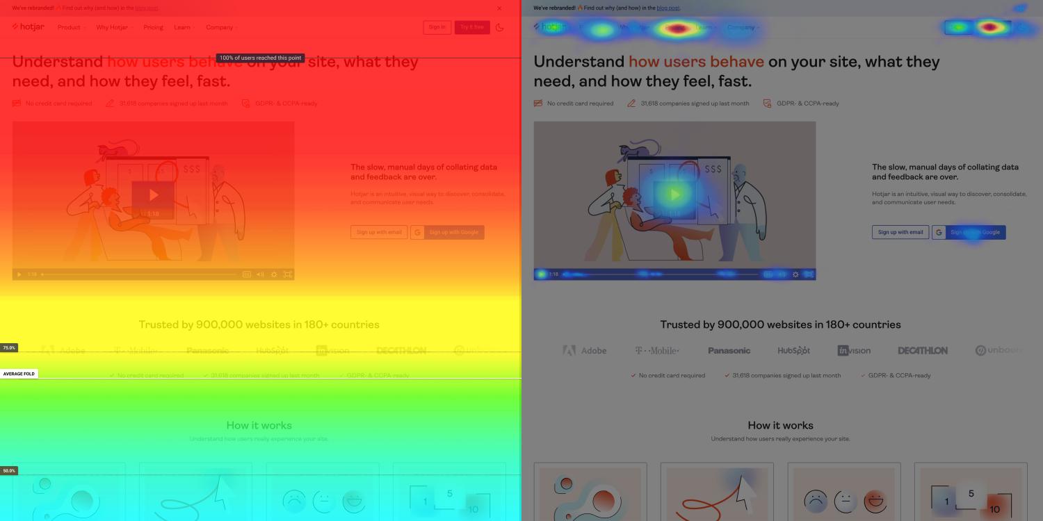
Website heatmaps visualize the most popular and least engaging element on your website using colors on a scale from red (hot) to blue (cold). It offers snapshots of how users interact with CTAs, whether they scroll through or ignore them.
Here’s an image depicting the functionality of heatmaps.
Here are the key types of heatmaps you can use for CTA analysis –
These heatmaps can help you gain insights into audiences’ intent and interaction with the CTAs. Make data-based decisions to optimize your CTA and boost engagement.
Next is the session recording tool. This qualitative research tool enables publishers to check out the playbacks of users scrolling, clicking, and moving on their sites.
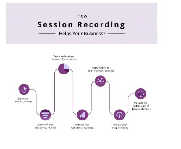
From the user’s entry to exit, publishers can map the entire journey.
Leverage recordings to see the performance of your newly uploaded CTAs. In addition, this feature can help you identify technical errors with the click functionality in the CTA button.
Check out a couple of cutting-edge heatmap and session recording software.

With Microsoft Clarity, publishers can gain actionable insight and see –
Furthermore, integrate Clarity with Google Analytics to explore why users drop off, don’t click, and more. Use these data-driven insights to make the most of this tool and achieve the best results.
Let’s discover the top six types of CTAs that can boost your conversion rate. Choose the most relevant CTA according to your goal.
#1: Lead Generation: This CTA intends to increase visitors’ website engagement and convert them into buyers.
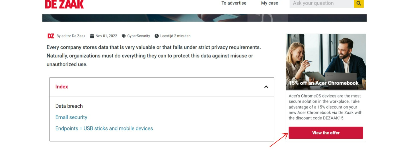
See the below-shared lead generation CTA on De Zaak’s website, an esteemed Dutch business publisher.
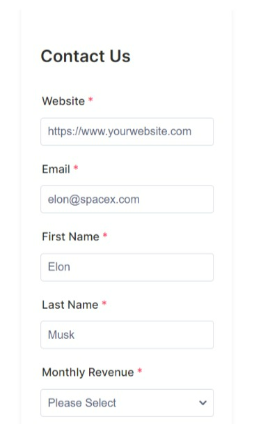
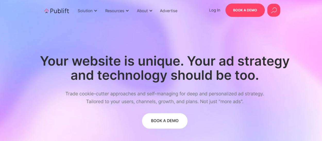
#2: Form Submission: This CTA encourages website visitors to fill out a form and submit their information to your database.
Check out Publift’s lead form shared below –
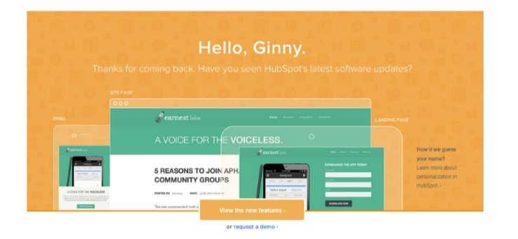
#3: Service or Product Discovery: This type of CTA offers your value proposition to the website visitors.
Notice how HubSpot uses this CTA to provide valuable product and service information.
#4: Tactical Content: Publishers can place CTA on pages depicting a checklist of product reviews to drive users to individual product pages, prompting them to click on affiliate links. This tactic can thus serve as a revenue generation source for the brands.
Check out how HuffPost takes advantage of this CTA tactic.
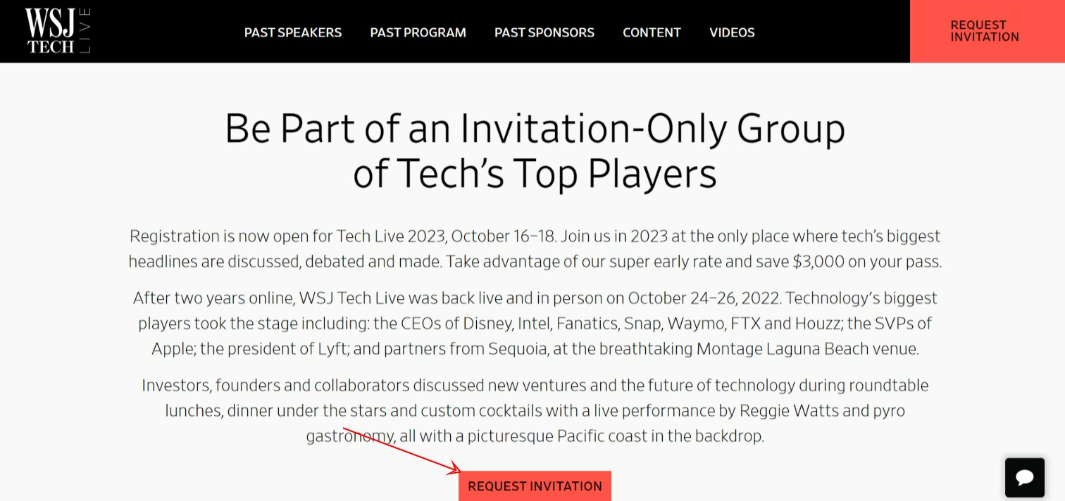
#5: Event Promoter: This CTA alerts visitors to discover more and register for upcoming events and promotions.
The below-shared CTA on the WSJ Tech Live website is a perfect example.
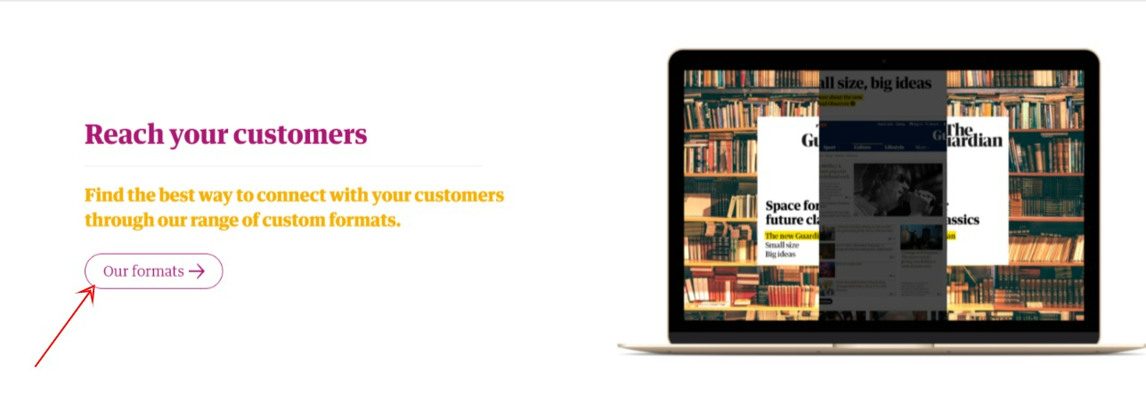
#6: Lead To Advertise with Us and Media Kit Page: This is a conversion-focused CTA that urges users to visit the “advertise with us” or “media kit” page.
Observe how “The Guardian” uses this tactic to highlight their beneficial services to the users and boost the chances of conversions.
Although we have already covered the best practices for CTAs, we suggest you quickly go through the following information. These below-shared insights can further strengthen your CTA strategy.
Let’s get started.
Try to place it wherever it adds value to the content. You can even add multiple CTAs to boost engagement.
Though creating CTAs is not rocket science, publishers can make silly mistakes that can reduce their effectiveness. This can harm their click-through rates. Here, we will discuss a few common mistakes that publishers should avoid.
Your CTA should deliver what it says. For instance, if you ask visitors to sign up for a free eBook, ensure they receive it. False commitments can impact your brand reputation and trustworthiness. This can ultimately lead to poor conversion rates.
The text you add with the CTA should reflect your brand’s tone. Using a different writing tone can confuse the readers and fail to engage them. This can lead to the loss of potential leads. So, maintain a consistent writing tone to keep their attention intact and inspire them to proceed.
A well-drafted CTA, when overlooked, may fail to achieve its goals. Place the CTAs at any location – be it above the fold or at the bottom of the page. The key here is to ensure they are distinguishable from other page elements.
Download. Subscribe. Click. Join.
Avoid using such single-word CTAs because they won’t help you generate clicks. Draft a compelling copy that conveys values and guides the users. As we mentioned, create a three to four-worded CTA to attract your audience. Leverage numbers to provide social proof. For instance, “Subscribe to join a community of 1,20,000!”
Readers on the pricing page look forward to buying a product. So, placing a CTA like “read more” can be a missed opportunity. On the other hand, including something like “Speak to our team” can work wonders. The crux is to align the CTA with the buyer’s stage in the sales funnel.
Despite creating an appealing CTA, you can get poor results. The ideal practice should be to test and select the CTAs that bring maximum click-through rates and conversions. Leverage the A/B testing method to choose the best CTAs for your website.
In this section, you’ll see how our team helped Publift leverage CTAs to improve user experience and conversions. So, observe the success story and get inspired to create click-worthy, engaging CTAs for your website.
Publift is an ad tech company that helps publishers monetize their websites with ads. Their local experts provide exceptional support to enable clients to maximize their ad revenue through technology, service, education, and expertise.
Publift was looking for a solution to improve their CTAs and drive more leads. That’s when they reached out to our team for help.
Here’s what we did for them:
#1: Implementation of a Lead Collection Form: We created a simple sticky right sidebar lead collection form for their articles. The idea was to capture the contact details of the publishers (quality leads) while offering them a great user experience.
Here’s how the sticky right sidebar lead collection form looks –
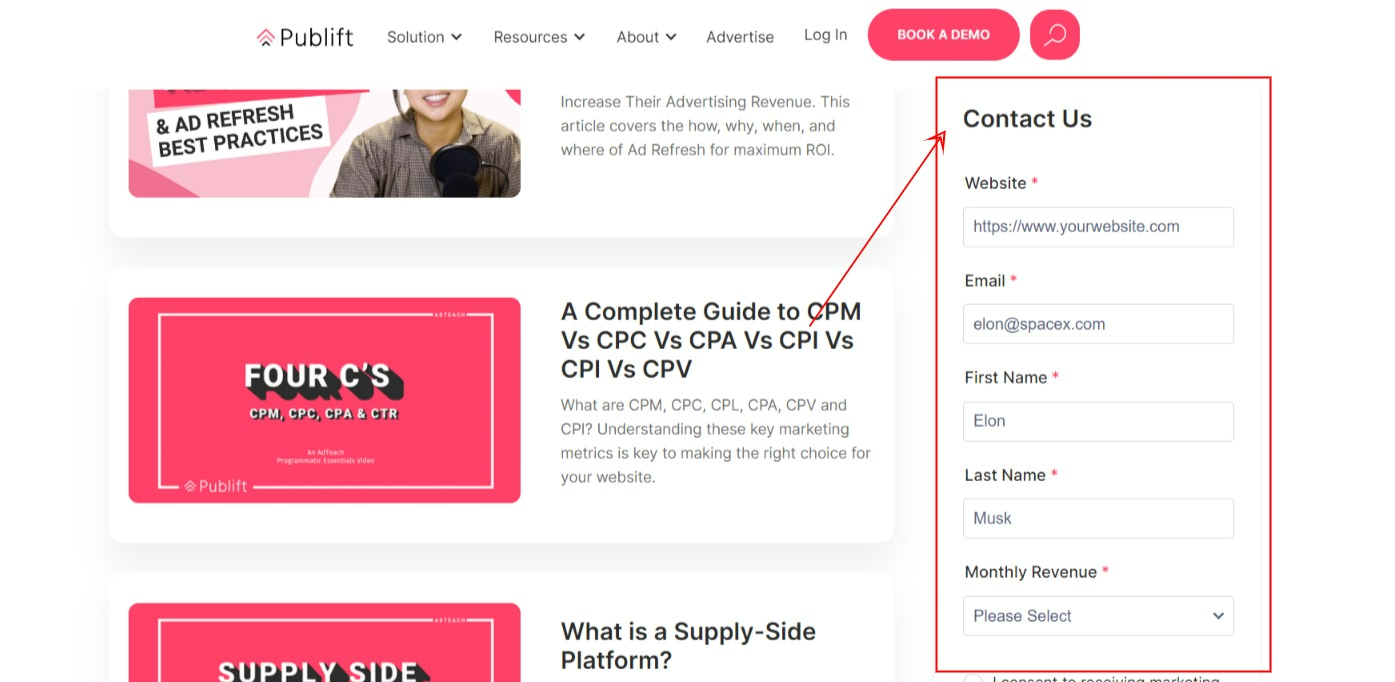
The result? This approach helped Publift drive more leads. To be precise, this strategy alone contributed to 50% of their YOY lead growth.
#2: User Behavior Analysis: As discussed, gauging user interaction with the website is pivotal to building a strong CTA strategy.
So, we used the Microsoft Clarity tool to analyze how Publift’s audience interacted with different types of pages on their website. Using these insights, we created and added specific CTAs like banners, in-article blurbs, and more.
Check out how we placed a banner at the end of Publift’s article to boost user engagement and conversions.
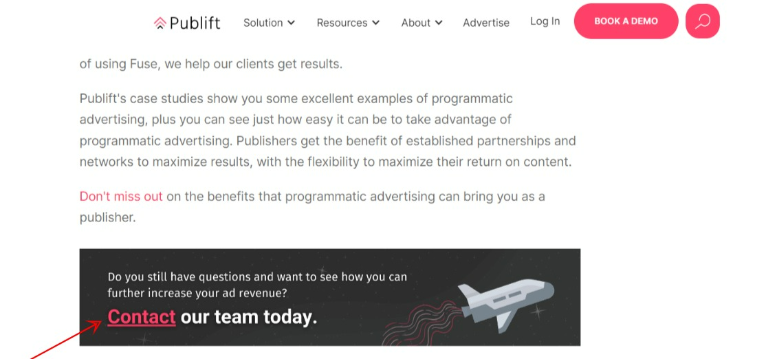
This strategy helped Publift with 62% lead growth in the past year.
Actions and Takeaways
A great call-to-action first grabs readers’ attention and turns their curiosity into buying intent.
After reading through this post, you should understand the significance of CTAs and the key tactics to leverage them. In addition, the best practices shared in this post cover all the vital elements of creating CTAs that inspire users to take action.
So, implement them to design actionable CTAs that convert hassle-free.