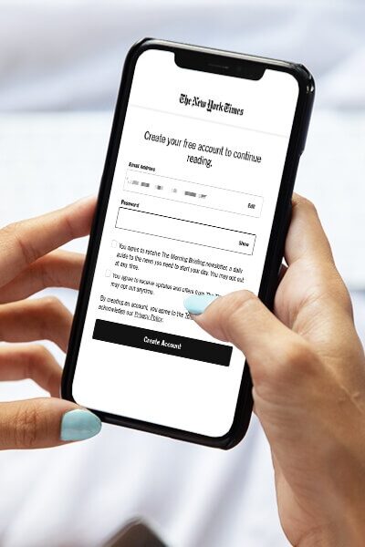
Paywalls have come a long way since The Wall Street Journal implemented the first-ever hard paywall in 1996.
By 2019, nearly 69% of all US and EU leading newspapers were operating a paywall. Another survey conducted in November 2022 among content marketers revealed that 14% used paywalls and/or subscription services as their preferred monetization method. This followed closely behind advertising, which was the choice of 18% of respondents.
Paywalls are quickly closing in on advertising as content creators’ preferred monetization strategy.
The introduction of stricter data privacy laws and the challenge this poses for contextual and targeted advertising is only expected to further fuel the rise of paywalls as an alternative to ad revenue. At the same time, paywalls can also complement ad revenue, helping publishers collect first-party data to show more contextual and targeted ads.
Given the increasing importance of paywalls to publishing, we dive into the world of paywalls, understanding how publishers can best implement paywalls around their content by looking at some of the most prominent examples from the publishing world.
What Is a Paywall?
A paywall is a feature that restricts access to all or certain parts of a website or app until a user takes a predefined action, such as buying a subscription.
There are four types of paywalls:
- Hard paywall: Users can only access content on a website or app once they pay.
- Metered paywall: Users can access a limited number of articles or pages before they’re asked to pay.
- Freemium paywall: The website or app’s content is divided into free and premium categories, with free content being accessible to all readers, while premium content is placed behind a paywall.
- Dynamic paywall: Dynamic paywalls are intelligent paywalls that leverage artificial intelligence (AI) and machine learning (ML) to set article limits and other restrictions based on user behavior and profile.
While not strictly a paywall, we also wanted to highlight adblock walls, which help publishers recover ad revenue lost to ad blockers. Adblock walls allow users an ad-free experience in return for buying a paid subscription or some other predefined action, such as signing up for a newsletter.
Publishers can implement a paywall on their website using a paywall management solution such as Aptitude or Fewcents. Check out our detailed guide on the best paywall services for publishers.
Best Paywall Examples for Publishers
Now that we understand what a paywall is, let’s examine examples of how large and small publishers implement it on their websites.
1. New Scientist
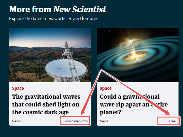
New Scientist is a UK-based science magazine that has been in publication since 1956. The magazine follows a freemium approach, clearly labeling whether the content is free or for subscribers only.
Source: New Scientist
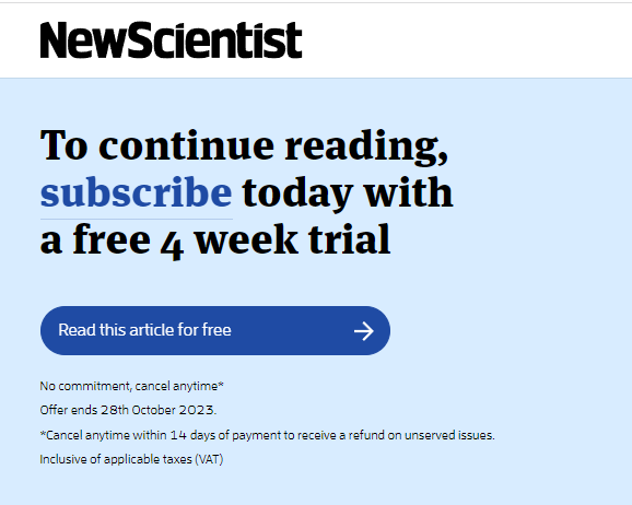
Clicking on a subscriber-only article allows users to read a part of the content before encountering a paywall. The paywall offers readers a four-week free trial, allowing for efficient content discovery.
Source: New Scientist
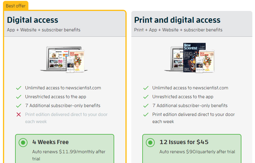
Clicking on the call to action (CTA) button leads users to a separate page where the different plans and their benefits are explained in detail. A punchy header prefaces the plans, encapsulating the New Scientist subscription’s value proposition in two short sentences. The website also displays its ratings on Feefo, a review platform, demonstrating social proof.

Source: New Scientist
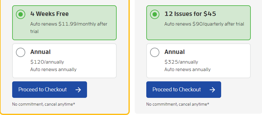
The page then lists the benefits of the magazine’s two plans in short, clear sentences.
Source: New Scientist
One drawback of this page is that it’s too long, forcing potential customers to scroll down to see the checkout button. This adds extra friction to the conversion funnel, potentially affecting conversion rates.
Source: New Scientist
What Works
- New Scientist’s freemium model allows users to read complete articles before deciding whether they want to pay for subscriber-only content.
- The value proposition in the header is punchy.
- The publisher’s Feefo ratings demonstrate social proof.
Opportunity for Improvement
- The scrolling paywall elongates the sales funnel adding friction to the conversion process.
2. New York Review of Books
The New York Review of Books (NYRB) is a New York-based literary magazine described as the “premier literary-intellectual magazine in the English language”. The magazine publishes book reviews, critical essays and cultural commentary.
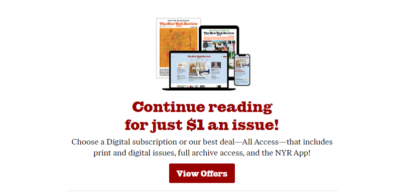
The NYRB uses a hard paywall that allows users to register for a single free article before paying for a subscription.
Source: NYRB
The payment page starts with a header that lets potential subscribers know that by subscribing, they’ll become a part of a small but intellectually exclusive audience. This messaging style nudges ambivalent audiences further down the conversion funnel by reinforcing existing positive biases.

Source: NYRB
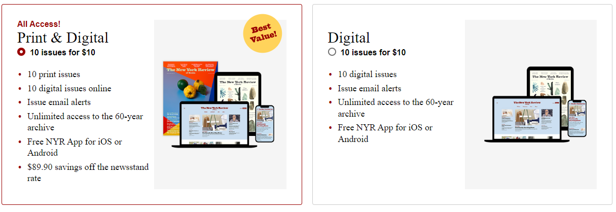
The NYRB offers two subscription plans, but doesn’t take users to a different page for payment. User information is collected on the same page by scrolling past the payment plans.
Source: NYRB
The only drawback the NYRB’s paywall and subscription pages have is that the red, gold and black color scheme combined with small fonts and exclamation marks give it an antiquated, stuffy look.
This contrasts with the fresh blue and white color schemes and large fonts of other paywalls examined in this list. However, the publisher’s long-standing brand value and trust with existing and potential audiences will go some way to offset this perception.
What Works
- NYRB uses a compelling value proposition that talks directly to its intended audience.
- The publisher’s single-page payment format speeds up the sales process.
Opportunity for Improvement
- The somewhat dated layout aesthetics may have limited appeal for a younger audience.
3. National Geographic Travel
National Geographic Travel (Nat Geo Travel) is a travel magazine published by National Geographic. The magazine follows a freemium model, wherein premium content is clearly distinguished from free-to-read content on its website with a lock symbol.

Source: Nat Geo Travel
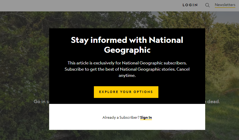
Unlike several other publications, however, Nat Geo Travel takes a more rigid approach to its premium content by preventing the reader from viewing any part of it. The entire page is grayed out, while the paywall occupies the page’s center. Most other publications allow users to view some of the paywalled content.
However, the magazine does have other free content for users to read and form an opinion on the website’s quality before subscribing.
Source: Nat Geo Travel
What Works
- The freemium model makes for effective content discovery, with plenty of free-to-read content helping with SEO.
Opportunity for Improvement
- The value proposition is weak and generic, focusing on “staying informed” rather than more tangible benefits.
4. Harvard Business Review
Harvard Business School’s management magazine, Harvard Business Review (HBR), uses a metered paywall that gives visitors access to two free articles a month. A sticky banner at the bottom of the page lets users know when they’re about to run out of their monthly quota of free articles.

Source: HBR
Users can access two extra free articles monthly if they register and sign in.
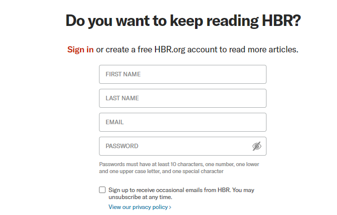
Source: HBR
Unlimited access is reserved only for premium users.
What Works
- The metered paywall enables greater content discovery.
- The publisher’s available article countdown creates a sense of urgency around the CTA.
Opportunity for Improvement
- The absence of a value proposition weakens the conversion funnel.
5. The Ken
The Ken is a business magazine focusing on India and Southeast Asia with more than 300,000 subscribers. The magazine uses a freemium paywall model that makes stories free for 24 hours after publication before moving them behind the paywall.
Unlike other websites focusing on content velocity, The Ken only publishes one well-researched, data-backed piece every day.
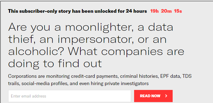
Source: The Ken
The Ken’s metered paywall banner has a countdown timer placed above the story that lets the visitor know exactly how much time they have to read the story before it becomes subscriber-only. The timer counts down to the last second, a feature not commonly seen in other metered paywalls.
What Works
- The Ken’s memorable approach to freemium paywalls means it stands out from its competitors.
- This also works well with its in-depth reporting style, which adds value to its archive.
- Making all content available for a single day after publication creates a sense of urgency for nonsubscribers to subscribe or visit every day.
Opportunity for Improvement
- The magazine’s descriptions of perks and benefits are very long and can possibly confuse users.
6. Courrier International
Courrier International is a French-language weekly paper that translates excerpts from more than 900 international papers and publishes them.
The paper uses a freemium paywall model, with subscriber-only content highlighted with a yellow lock symbol.
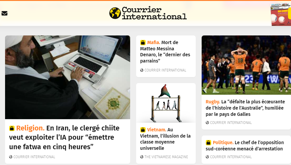
Source: Courier International
Clicking on a premium article brings users to a paywall that asks them to buy a subscription to read the article. Users are, however, free to read as many non-premium articles as they like.
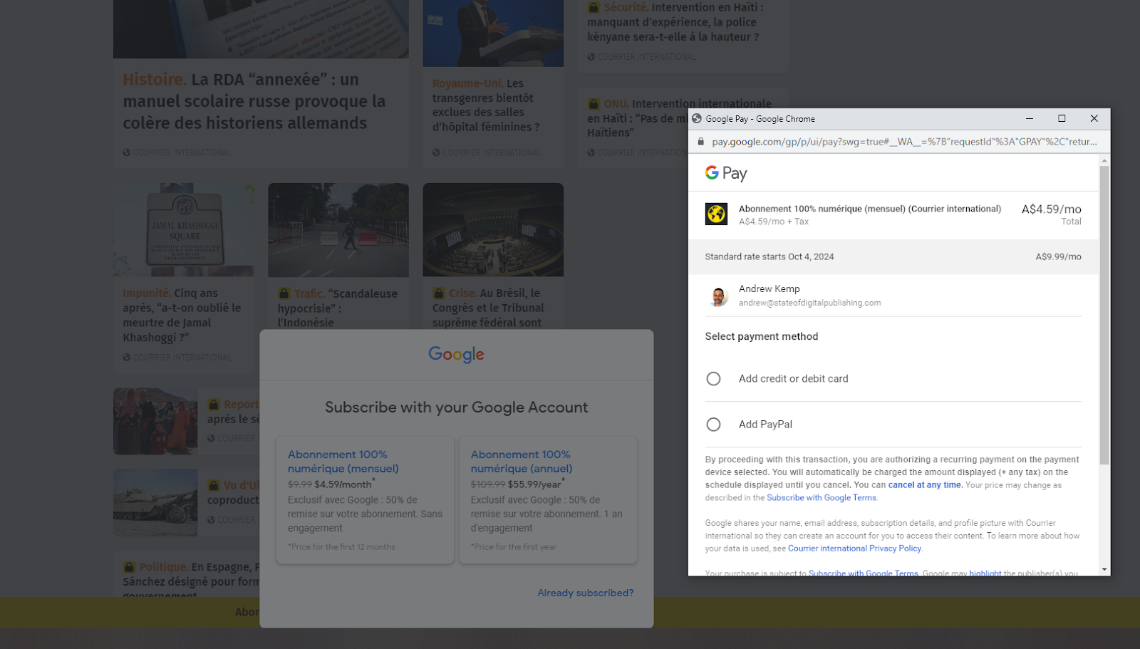
Courier International has a clean CTA offering prospective subscribers the opportunity to subscribe either through the publisher’s payment portal or through Subscribe with Google, with the available discount clearly highlighted.
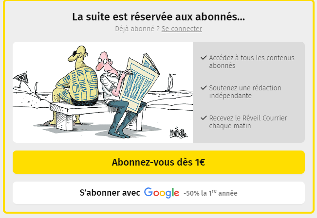
Source: Courier International
Not only is the availability of choice important for consumers, but Google’s subscription tech streamlines the conversion process significantly by reducing the number of inputs required while also displaying the cost in the user’s local currency.
Source: Courier International
What Works
- Courier International has clearly labeled and segregated its free and premium content, streamlining user navigation.
- The prominent CTA stands out within the paywall message.
- The publisher has used visuals, in this case a cartoon, to further reinforce the messaging aimed at potential subscribers.
- Including a Subscribe with Google option along with a discount streamlines the conversion funnel.
7. The Seattle Times
The Seattle Times is a daily newspaper published in Seattle, Washington, since 1891. A recipient of 11 Pulitzer Prizes, it has the largest newspaper circulation in the US Pacific Northwest.
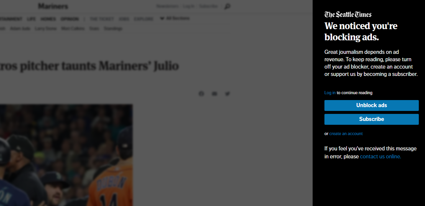
The paper uses both a metered paywall and an adblock wall. The adblock wall restricts access even to free content, giving them two options — unblock ads or buy a subscription.
Source: The Seattle Times
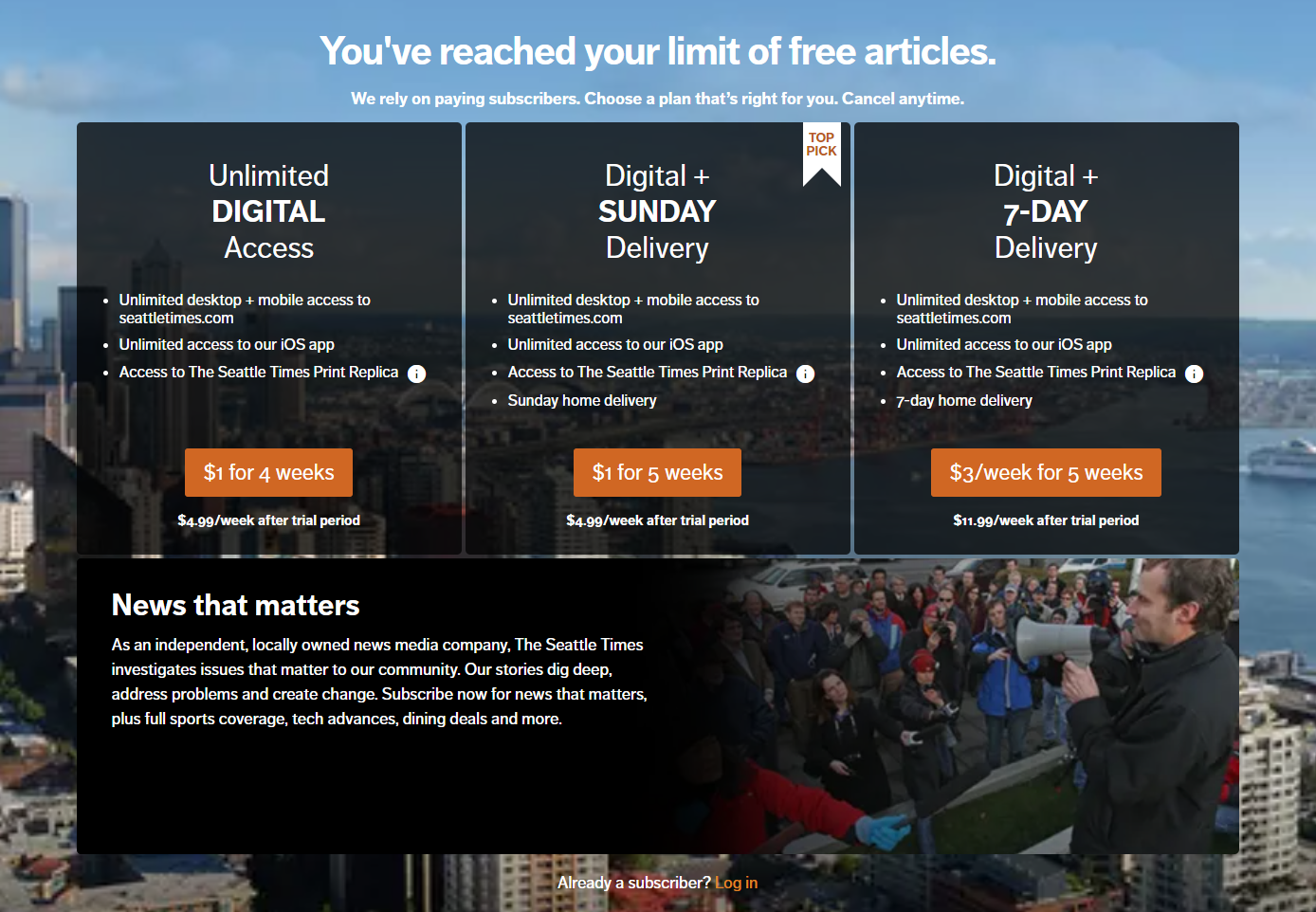
Users can also create an account to access a certain number of articles for free. This metered approach allows for better content discovery.
If the visitor chooses to unblock ads then they’ll be able to enjoy two free articles.
Source: The Seattle Times
In keeping with its tone and style, the paper uses a serious, emotive tone to communicate its message rather than relying on wit and humor some other publications use.
One drawback here is the value proposition’s placement below the subscriber plans, which is counterintuitive. The value proposition is meant to guide the customer down the conversion funnel.
What Works
- Users can access some premium content by turning off their ad blocker.
- Honest and candid messaging that speaks about the importance of ad and subscriber revenue.
Opportunity for Improvement
- Users can’t even read snippets or free samples without subscribing.
- The value proposition’s placement is counterintuitive.
8. India Today
India Today publishes national and international news articles and uses freemium, metered and adblock wall strategies.
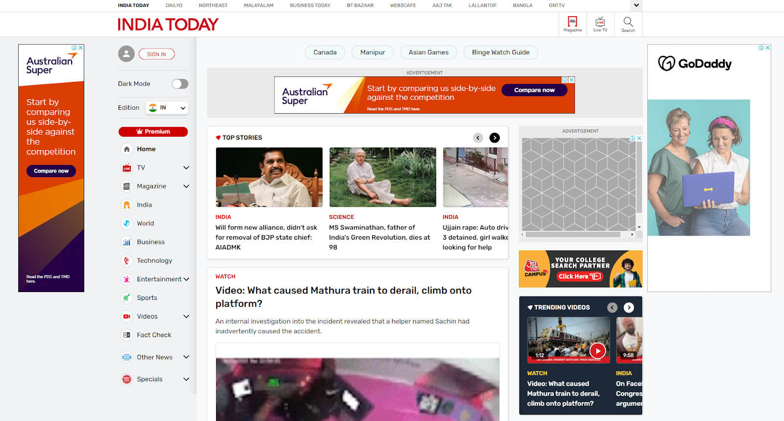
Most of its content is free for visitors, though the site leans heavily on ads that disrupt the reading experience while slowing down page load times.
Source: India Today
A handful of articles are marked as premium and placed behind a metered paywall, which allows the audience to read two premium pieces per month for free.
Buying a subscription allows users to read all content without ads while giving them unrestricted access to premium content.
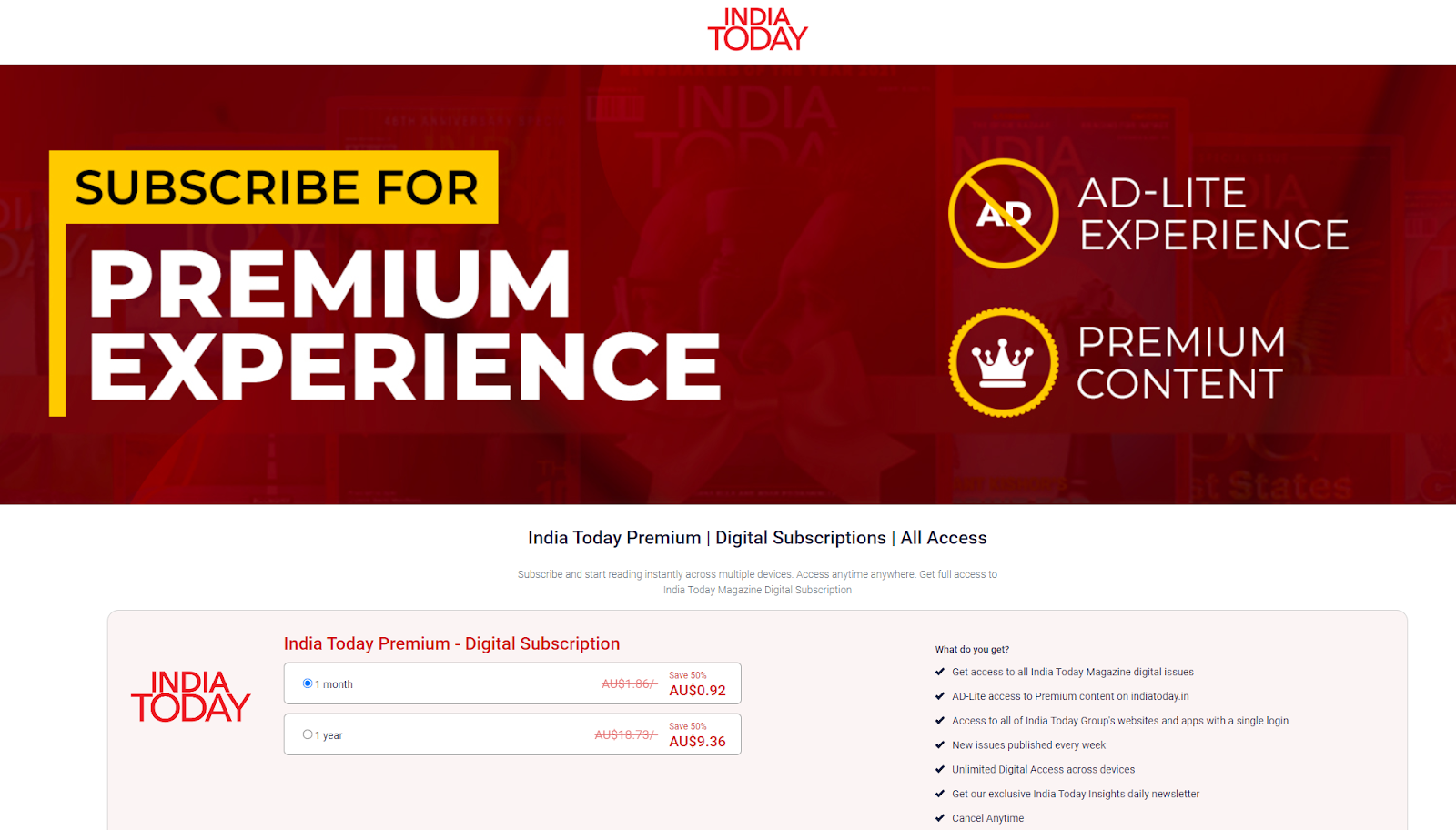
Source India Today
Of interest is the fact that unlike other adblock strategies used on this list, ad blockers still work on content that’s free.
What Works
- Plenty of free content on the website for users to judge quality and value.
- Subscriptions give ad-lite access to premium content.
Opportunity for Improvement
- The free version of the website is ad-heavy, which may put off potential subscribers.
- Adblockers still work on free content, meaning some ad revenue is lost.
9. The Australian
The Australian, a New South Wales-based national daily, uses a hard paywall for its online edition.
The Australian’s readership stood at 4.37 million in June 2023, with the average person spending 13:00 minutes on its website. It was ranked among Australia’s top 10 most visited news sites, the only site using a hard paywall to appear on the list.
Clicking on any story lets viewers see a snippet of the content in a window on the left, while the user is presented with a subscription window on the right. This strategy gives the reader a taste of the content, encouraging them to buy the subscription.
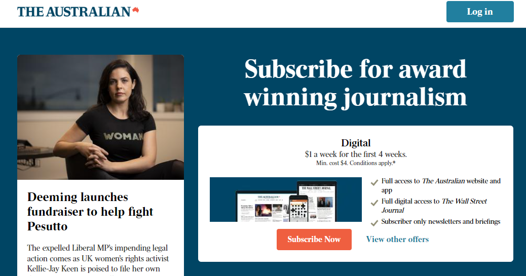
Source: The Australian
The paywall appears alongside the content snippet, meaning users don’t need to scroll down the page. This is a refreshingly different approach from normal paywalls, where the user typically sees a block or blocks of content, before having to scroll down to the paywall.
The website then displays the subscription plans, listing all the features and benefits below this screen.
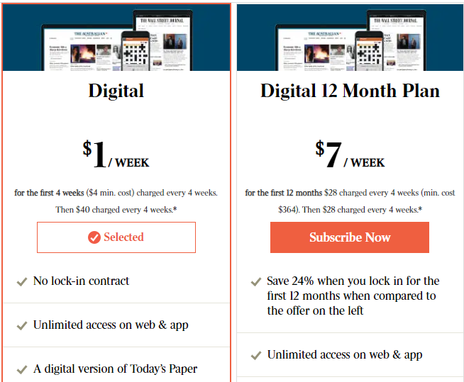
Source: The Australian
What Works
- The paywall appears in the same panel as the content snippet.
- A two-tiered subscription strategy makes it easy for users to process the offers.
10. The Africa Report
The Africa Report is a France-based, English-language magazine that covers African business and politics. Together with its French language sister publication, Jeune Afrique, the magazine has more than 12 million monthly readers and is a multiple-time recipient of the Diageo Africa Business Reporting Award.
The magazine follows a freemium paywall strategy, with subscriber-only content marked with a label above the headline to make it easily identifiable.

Source: The Africa Report
Meanwhile, the free-to-read articles end with a banner that contains a value proposition for the reader to subscribe to.

Source: The Africa Report
What Works
- The Africa Report uses a strong value proposition.
- Clearly labeled free and subscriber-only content
11. The Sydney Morning Herald
The Sydney Morning Herald (SMH), founded in 1831, is Australia’s oldest continuously published newspaper. It is also the country’s most-read newspaper, with more than 8.4 million readers across its digital and print editions in 2022.
The SMH uses a metered paywall that gives visitors two free articles without registering or subscribing.

Source: The Sydney Morning Herald
A pop-up window at the bottom of each article informs the reader of how many free articles they have left while prompting them to register or buy a subscription.

Source: The Sydney Morning Herald
An additional four news articles per month can be viewed by registering with the paper, with each new page visit encountering a banner with an article countdown.
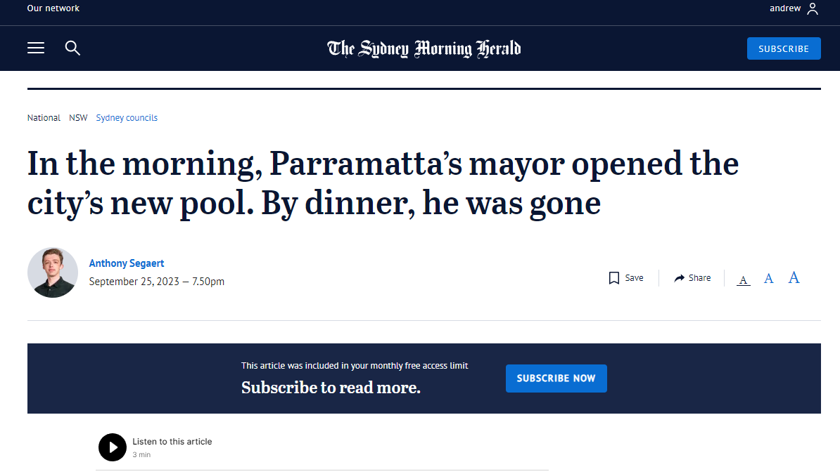
Source: The Sydney Morning Herald
Some content, such as opinion and lifestyle articles, is reserved exclusively for paying subscribers.
What Works
- Metered paywall allows for effective content discovery, without giving away too much premium content.
- Registering for additional monthly access helps move visitors further down the conversion funnel.
Opportunity for Improvement
- The Sydney Morning Herald hasn’t offered a value proposition to prospective subscribers.
12. Masterclass
Masterclass is an online learning platform that allows users to access content after they pay a subscription fee.
Being a video-on-demand (VoD) platform, the Masterclass paywall is designed differently from magazines. Paywall VoD websites tackle the challenge of content discovery by allowing users to play trailers and samples to help them decide whether they want to pay for the video.
All the key data points, including billing and a content summary, are summarized for users. Whilst premium content streaming services may be working with a different medium, the essential principles in building a good paywall remain the same.

Source: Masterclass
The Trailer, Sample and Share buttons are all located within close proximity of each other and right above the CTA button. This ensures that the user never has to leave the viewport or scroll away at any point in their journey to sample or share the content before deciding to subscribe.
What Works
- Sampling and sharing are readily available so as to avoid disrupting the consumer journey.
- Masterclass has included a bold, bright CTA button that stands out from the black background.
- Slick, cinematic black-and-white layout aesthetics enhance the paywall’s visual appeal.
Best Practices for Paywall Design for Publishers
Successful paywall and subscription strategies hinge on intelligent paywall design. Let’s look at a few strategies to keep in mind when designing a paywall.
1. Include a Strong Value Proposition
A value proposition lets readers know, very briefly, why they should pay money to read a website’s content. It’s often different from a detailed subscription plan, which most websites display on a separate page.
A strong value proposition is essential for small to mid-sized publishers who must build their audience.While The New York Times may not need to display a value proposition statement on its paywall, a five-year-old content website with 50,000 monthly visitors will.
New York-based The Juggernaut, a subscriber-only magazine that covers issues related to the South Asian diaspora in North America, is an excellent example of a succinct value proposition. Their value proposition statement lets the reader know that they can expect high-quality content from a South Asian perspective.
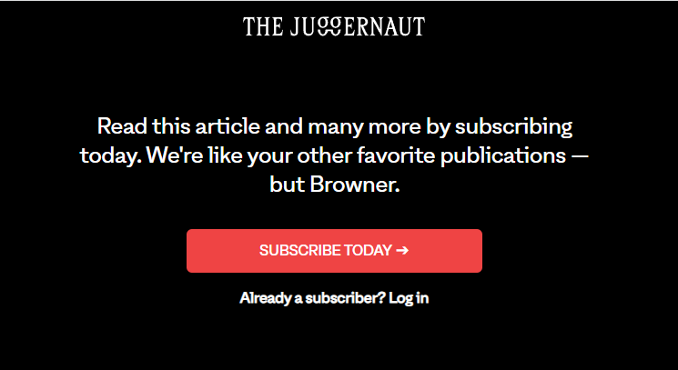
Source: The Juggernaut
Netflix paywall analysis reveals a similar strategy at play, with the proposition making it clear to the visitors what they can expect.

Source: Netflix
2. Keep the Messaging Concise and Clutter-free
Too much text dilutes a paywall’s power to incite decisive action. Concise and well-spaced-out text can more effectively draw in a viewer’s attention. A good example of this principle is the Times’ paywall.
The UK daily, which has been in publication since 1785, is an iconic publication known for being the originator of the Times New Roman font. The font is widely used in publishing and official documents for its neat, uncluttered appearance.
In keeping with this philosophy, The Times’ paywall has a simple yet concise message that conveys all the information a reader needs to know about subscribing while retaining plenty of white space.
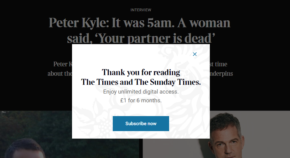
Source: The Times
Content from our partners
Eight words, two digits and a character is all the paywall needs to outline the benefits of a subscription and its introductory cost.
In contrast, The Ken offers a host of tiered plans, presented to the user through large amounts of text and long sentences.
Moreover, the price of each plan isn’t mentioned at the top, meaning the user has to scroll past the text to find the information.
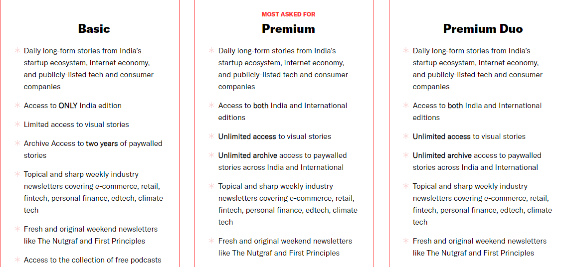
Source: The Ken
A more effective strategy for presenting tiered subscription plans with multiple benefits would be to compress the various perks and benefits into the absolute essentials and use visuals, if possible, to reinforce the points.
For instance, Jstor Daily presents its tiered subscription plans in three boxes with plenty of white space, making it easier for the user to absorb the information. Each plan’s price is listed at the top, while the perks and benefits are reinforced through images representing the scope of insight.
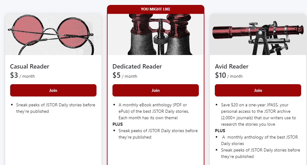
Source: Jstor Daily
3. Leverage Colors to Draw Attention to the CTA
The call-to-action (CTA) button is the most important component of the paywall design, as it leads directly to a conversion, which means it has to stand out from the rest of the message.
A good example is this message from Sentient Media, a news website dedicated to creating awareness about sustainable agriculture and the prevention of cruelty towards animals. Although the content on the website is free to read, a pop-up greets visitors and asks them to subscribe to its newsletter.
The CTA button is the Sign Up button, which uses white text against a black backdrop. The black and white button is then juxtaposed against a rust-colored background, allowing it to stand out.

Source: Sentient Media
The value proposition statement, meanwhile, lets the reader know why they should subscribe to the newsletter.
Having a single CTA on a paywall is also a good practice. If more than one CTA is needed, it’s a good idea to clearly differentiate them, or there’s a risk of creating ambiguity for the reader.
The Loadstar, a logistics and supply-chain magazine, is an example of this, using two CTA buttons of the same color.
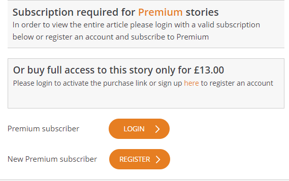
Source: The Loadstar
The buttons’ light orange color also doesn’t stand particularly well against the white backdrop. The buttons’ white text further robs them of distinctiveness, giving the whole paywall schema a somewhat faded appearance.
4. Choose Between a Scrolling and Fixed-Height Paywall
When users have to scroll down a paywall to read all its perks and benefits and click on the CTA button, it adds an extra step in the conversion funnel, potentially decreasing.
For instance, the Luxembourg Times has a paywall in which users must scroll down the benefits list to click on the CTA button. This is an example of a scrolling paywall.
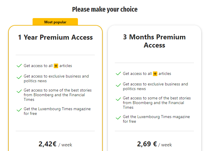
Source: Luxembourg Times
On the other hand, fixed-height paywalls present the message and the CTA on the same screen so that the user does not have to scroll down to make the purchase. However, the disadvantage is that it limits the information that can be conveyed to a user.
The Globe and the Mail is a good example of a fixed-height paywall where all the information is presented to the user in a static message box.
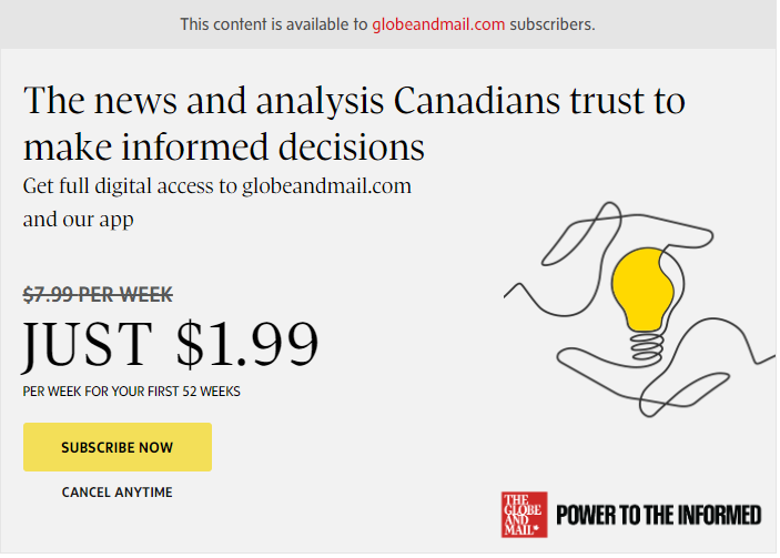
Source: The Globe and Mail
5. Decide Between Client-Side and Server-Side Paywalls
Publishers must choose between client-side or server-side paywalls, with the former facilitating discovery at the expense of security and the inverse being true for the latter.
With client-side paywalls, the content is delivered on the client’s machine but is hidden. This makes client-side paywalls easy to circumvent, resulting in lost revenue for publishers. In fact, a 2022 survey among US consumers found that 53% of the respondents surveyed attempted to circumvent paywalls.
Server-side paywalls, on the other hand, are nearly impossible to circumvent. With such paywalls, the content is delivered to the user’s browser only if they have the required permissions to view it. The drawback is that such content is not available for Google to crawl and index, making discovery via search engines difficult.
Server-side paywalls are commonly used by prominent publications such as NYT, The Economist, Financial Times, etc.
It’s a difficult choice to make, one that will have long-term ramifications on content creators’ ability to build and monetize their audience.
Final Thoughts
Publishers are increasingly experimenting with paywalls to either complement or completely substitute their ad revenue models.
Moreover, with the arrival of generative AI-based tools, the internet looks set to be flooded with generic, machine-generated content. In such a scenario, having high-quality, premium content is one of the most effective strategies for publishers to stand out.
Paywalls and subscriptions are one way to let potential readers know they can expect content worth their time and money.
Not all paywalls, however, are created equal.
We’ve seen how specific strategies, such as server-side paywall implementation, are better suited for larger, established publishers who aren’t overly reliant on search engines for content discovery.
On the other hand, smaller, newer publishers must work with a separate toolkit that suits both their means and their strategic objectives, such as audience building and brand recognition. These players will need a solid paywall SEO strategy that helps with content discovery and conversions.


