What is actually a newsletter? In theory, it’s a bulletin, magazine, or other content sent to subscribers by e-mail, usually for free. From the publisher’s point of view, it’s one of the simplest and cheapest ways to build a relationship with the readers, show them the brand value, and – in the long run – get paying customers. Big deal in an inconspicuous form.
So, how to create a newsletter to achieve all of these goals? Check out my article full of practical tips.
But firstly, let’s check if the game is worth it.
Why should you create a newsletter?
According to Microsoft’s report, the consumers’ attention span is getting shorter and shorter:
“In 2000, the average attention span was 12 seconds, but this has now fallen to just 8.”
What does it mean for your website? If you don’t get someone’s attention in time, you could lose them forever. A newsletter is a way to make things different.
When visitors go into your website and see the offer which they might be interested in, they’ll share their e-mails with you to get it. If you have e-mail addresses of people who are curious about your brand, you’ve got everything: you can communicate with them, build a relationship, send special offers (e.g. about lower products prices), encourage them to the next visit to your website, etc.
To make this happen, collect data – build a mailing database to which you will send valuable items. Thanks to it, you establish a line of trust between you and the visitor, and that is the most important value in the digital world. Keep an eye on the statistics of opening e-mails – how many people do it, at what time, on what days, etc. You’ll get free hints on what needs to be changed in your newsletter.
You should take care of the group of people who sign up for your newsletter, because there’s a big chance that they’ll visit your website again and go deeper into the sales funnel in the future, becoming your paying customers.
How to create a popup encouraging to sign up for a newsletter?
You’ve probably experienced many times the situation when, right after entering a website, a million pop-ups, offers, or advertisements appear in front of you. So you try to close all of them in a rush without looking at them. If this sounds familiar, you already know what not to do. Your task is to create such a pop-up which will get them interested in the text on it and take their time to actually read it.
Remember about three important things:
- Design. Put one, simple, non-aggressive, non-invasive pop-up on the bottom of the website. It should include a value people will get if they sign up, the place for an e-mail and clear CTA (“sign up”, “get it”, etc.).
- The copy. “Sign up for a newsletter” won’t work. It’ll be better if you inform people about getting a free bonus after entering an e-mail address or, for example, announce a newsletter with tips, articles; in short: the value that will be of interest to the visitors; a specific value. You know what they need the most.
- The time. Think about the moment, when the pop-up should appear: immediately after entering a website or after a visitor scrolls down a little or spends some time there? When it appears after some time, the chance that your leads will be more valuable is bigger. When it appears just after entering the website, it’ll probably be closed and make the visitor angry.
The example of a pop-up on PressPad Blog
How to create a perfect newsletter?
If you’ve already encouraged visitors to subscribe to your mailing list, you are halfway to success. Now you have to make sure that they want to stay with you and get the newsletter regularly. How to do it? What content and in what form should you send to people? Here are some of the elements you should pay attention to.
- Valuable content. Do you promise people they’ll get valuable content? You have to keep this promise. Put into your newsletter something that they don’t find on your website, e.g. some extra value, real-life situations, lessons you’ve learned, secret statistics, etc. The valuable content will make people stay. With every send bulletin, the chance that people enter your website increases – such as the chance that they purchase something there or click an ad.
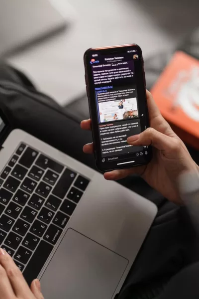
- Mobile-friendly form. We all check e-mails on mobile devices. What many entrepreneurs forget about is that your newsletter has to be mobile-friendly. The main rule is simplicity and transparency. In this case, less means more. 81% of people use a smartphone for checking e-mails on a regular basis. Getting a newsletter on a smartphone is not a hassle, provided that it can be read by scrolling down, not by pinching and dragging the text. A single-column format makes the newsletter easy to read on tablets and smartphones. My best tip is to check it on your own smartphone before sending it to your subscribers.
- Unsubscribe button. Don’t try to get a million subscribers. It’s not the point. If someone wants to leave, give them this opportunity. Focus only on people who want to be with you. If someone wants to resign and doesn’t see an unsubscribe button, they will just be annoyed. Place the unsubscribe button away from all other buttons. You don’t want the unsubscribe button anywhere near another button where it could be clicked by mistake.
- Smart CTA. Newsletters are a great form to encourage people to other activities. You can give readers an opportunity to “read the article”, “visit a website”, “contact you” or “share it”. Personally, I like the last one. People can send an article to their friends even before they read it!
What influence has a newsletter on monetization?
The answer is simple – huge.
Let’s imagine: you send newsletters, people sign up, get content and they love it! At the same time, they start to follow you on social media channels, your website statistics boost but… your revenue does not. What’s wrong?
If you already have a big audience, which you communicate with via newsletter and other channels, it’s time for step two. Big step two called monetization.
- Implement the paywall. It’s through such engagement that you can strengthen ties with your readers by showing them that your content is worth paying for. The paywall model has proven effective for newspapers because when they gate access, people feel they need to pay for it and they’re used to paying for news. They’re most likely to do this with the publishers and brands they trust most.
- Offer paid newsletter. You can prepare a few newsletters like Romania Insider does. Visitors can sign up for one of the ten themed newsletters, five of which are free, and five premium, covering the entire array of topics, they pick what type of info they want to receive, and how often it reaches their inboxes.
Newsletters worth sharing
Everyone signs up for different newsletters because of different reasons: from true love for a brand to getting a discount on first purchases. Have you ever analyzed newsletters you signed up for? Are they well-designed? Do you enjoy reading them? Does something make them stand out? Some companies prepare amazing newsletters we can learn from. Among newsletters that I subscribe to and love are Medium and Goodreads. They are different from each other, but both are great.
What about you? Which newsletter has amazed you lately?


